


Airtable has always been recognized as an effective tool for organizing and storing data, combining the simplicity of a spreadsheet with the flexibility of a relational-style database. But, while the raw Airtables bases got the job done, they weren’t always intuitive and, as a result, could be overwhelming. Since most users interact directly with the data through table, kanban or list views, these users often need to be trained to carry out processes intended by the builder, rather than intuitively being able to understand actions like updating, searching, filtering and deleting.
For this reason, most companies opt to simplify core data actions into a GUI (graphical user interface), often so that users can be onboarded more quickly with less technical training, and to leave less margin for error by controlling actions. In internal tools, this allows for a more user-friendly way to interact with data, through components like buttons, tables and forms, rather than working directly on the database itself.
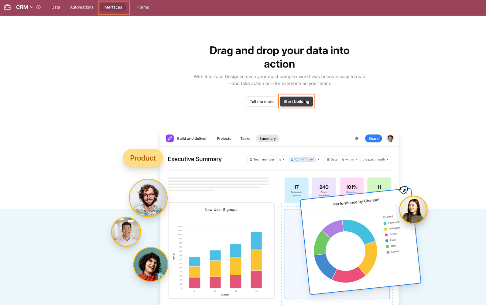
Interfaces are Airtable’s way of plugging this gap, targeting customers that might otherwise use platforms like Glide, Softr or Retool to build out GUIs on their Airtable data.
Interfaces provide a way to build dashboards, forms, and views that sit on top of your data. The idea is simple: instead of forcing your team to work directly with the source database, which may contain data superfluous to their specific purposes, Interfaces facilitate the creation of clean, focused UIs that surface only the most relevant information and actions for specific roles or tasks. For example, a sales team can have a pipeline view, while project managers can see just the tasks for which they’re responsible, without overwhelming users with unnecessary data.
In this tutorial, we’ll build on the CRM foundation we set up in Airtable CRM Tutorial and show you how to create an Airtable interface and a CRM dashboard for managing your customer pipeline.
By the end of this tutorial, you’ll know how to:
- Set up and configure different elements in Airtable Interfaces.
- Create tailored views and pages to keep the user experience focused on their role and simplify actions
- Build dashboards that provide instant visibility into your data and help teams in their decision-making process.
Building your first Airtable interface
In your Data editor, head to the Interfaces tab in the upper toolbar and click Start building.
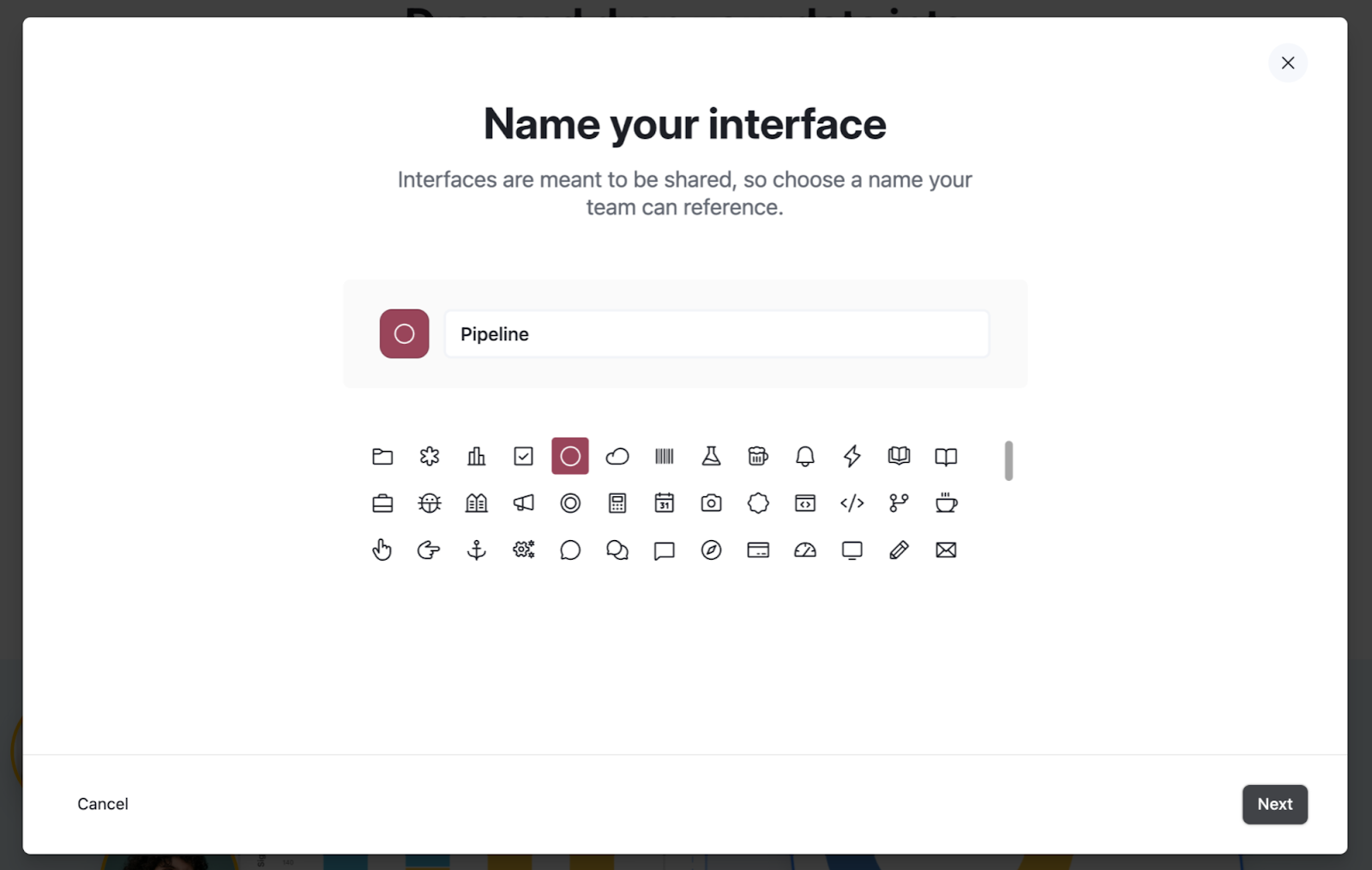
A pop-up will appear asking whether you want to build an interface or a form. Select Build an interface. On the next screen, rename your interface “Pipeline”, choose an icon that fits, and click Next.
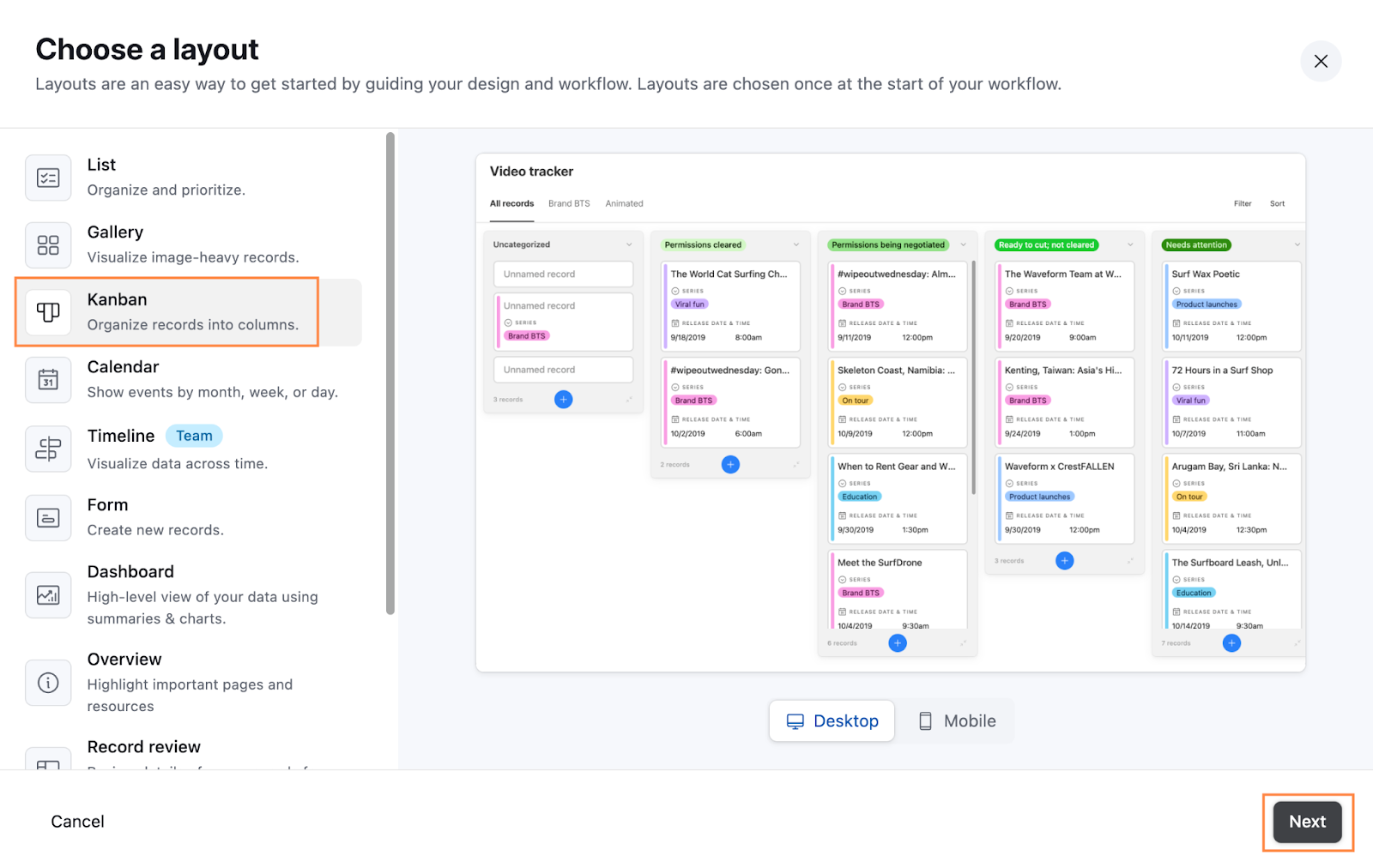
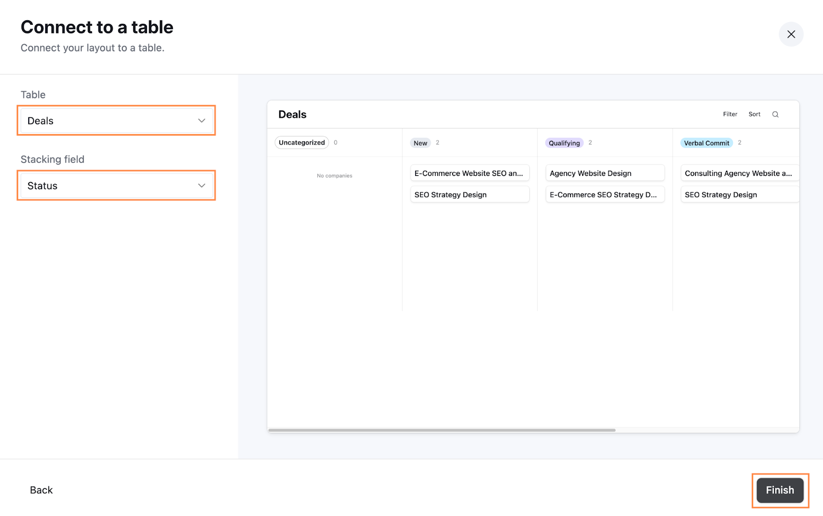
Now, you’ll choose a layout. For a pipeline, Kanban is the best option as it gives you a clear visual of where deals are in your process. Select Kanban and click Next.
Finally, you’ll define your data source. Under Table, choose Deals, and under Stacking field, select Status. When you’re done, click Finish.
So far, we’re looking a lot like a normal Airtable base, but no worries, we’ll dig deeper in the next steps.
Interfaces overview: key terms
Now you have created your first Interface. Before we jump into configuring everything, it’s helpful to get familiar with the different building blocks in Airtable Interfaces. There’s a lot you can do, and it might feel overwhelming at first, but breaking it down makes it much easier to understand.
Here are some key terms:
Interface: This is the top level of your setup. It’s a collection of pages, layouts, and configurations you use to display and interact with your data. Think of it as the overall structure for your app.
Page: Within an interface, you can create multiple pages, each serving a specific purpose—like a dashboard, a form, or a filtered view of your data.
Layout: This determines how the data is displayed on a page. Airtable offers layouts like Kanban, Grid, Timeline, and Gallery, each designed for different types of data and workflows. Each layout also comes with its own settings, which might differ depending on the layout type.
Form: A specialized type of layout for data entry. Forms let users add new records in a controlled way. For example, in a CRM, you could create a form with required fields that prevents users from submitting new deals without entering a deal’s name, owner, and amount—ensuring data is populated consistently and correctly.
Record: A single row in your Airtable table. In a CRM, for instance, a record might represent a deal.
Field: The individual pieces of data within a record, like Deal Amount or Deal Stage. When configuring your records, forms and layouts, you can decide which fields to display, edit, or highlight based on the context.
Group: Groups let you organize fields into sections within a form, such as Deal Overview, Account Details, or Contact Info. They also give you a means of organizing different dashboard elements into groups. This provides structure to make the system easier to work with.
Actions: These make it possible for the user to take specific steps directly from the interface. For example, you can add a button to create a new record, navigate to a different interface, or trigger an automation. Actions make your interface more interactive, turning it into a functional tool rather than just a static display.
Number: A dashboard element that displays a numerical summary of your data, like the number of open deals.
Records (not to be confused with Record): This is a detailed list of records tied to a condition that has been summarized by a Number component. For example, if the Number element shows the total number of open deals, the Records view will list those specific open deals.
Chart: A dashboard element that visualizes your data in a chart format, like deals grouped by status.
Pivot Table: A dashboard-specific element for summarizing and analyzing data in table form. This is only available on Team plans or higher and is great for creating detailed, cross-dimensional data breakdowns.
Now we have an idea of some of the core components of the Interfaces offered in Airtable, let’s run through what these actually look like in practice.
Pro Tip: If you’re ever unsure about what you’re configuring, take a quick look at the title of the configuration pane. It’s an easy way to stay on track and understand exactly which settings you’re adjusting in the side pane.
Configuring your page
To get started, in the left sidebar, click on the Deals page (within the Pipeline Interface) to open the Page settings. Under Title, rename it “Deal Pipeline” to make it more descriptive.
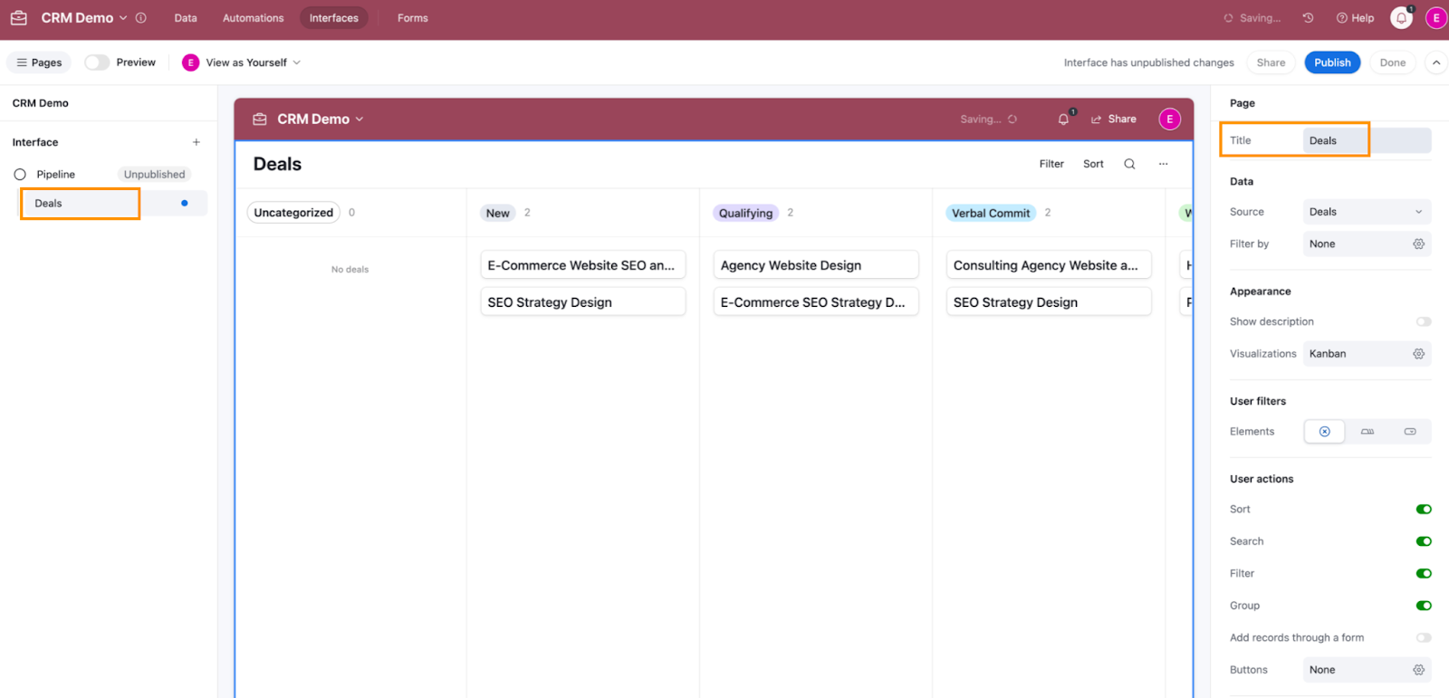
Next, in the Page settings on the right-hand sidebar, we’ll adjust the User actions, i.e. the actions that they can take on this page:
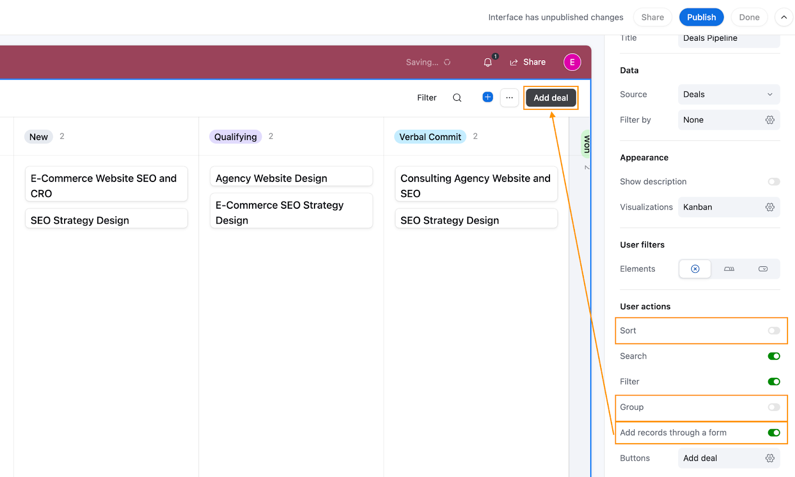
- Untoggle Sort: Since we’ll be predefining the sorting order to prioritize how deals should be handled, there’s no need to allow users to sort manually.
- Untoggle Group: Deals are already grouped by status, so additional grouping options could create unnecessary confusion or clutter.
- Toggle Add records through a form: This ensures users can only add new deals through the intake form, enforcing consistent data entry. Once this is toggled, you’ll see a new Add deal button appear in the upper right-hand corner, which opens the form for adding new records.
Intake form configuration
Now let’s configure this form for adding new contacts.
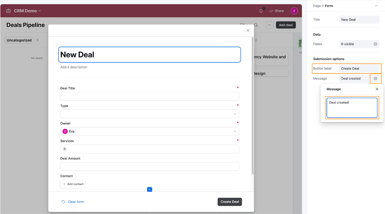
Click on the Add Deal button and select Edit form to open the Form setup screen.
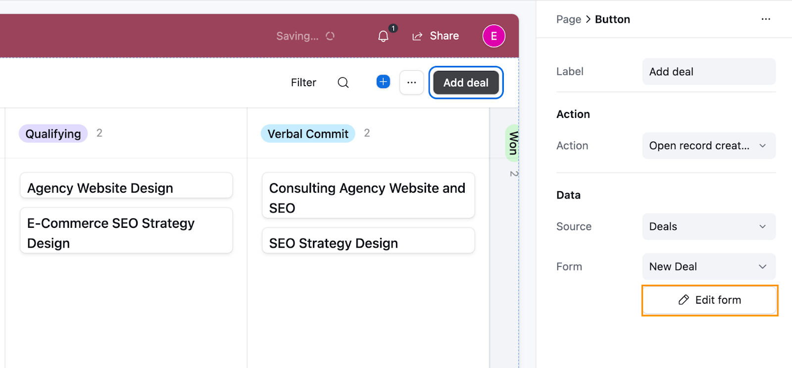
On the form, in the Form configuration pane, set the title to “New Deal” so the user knows exactly what action they are taking. Under Data > Fields, click on the cog to open the settings. Here, you can select which fields should be visible on the form for users to populate and which should be hidden. For example, we set the following fields to be visible on the form:
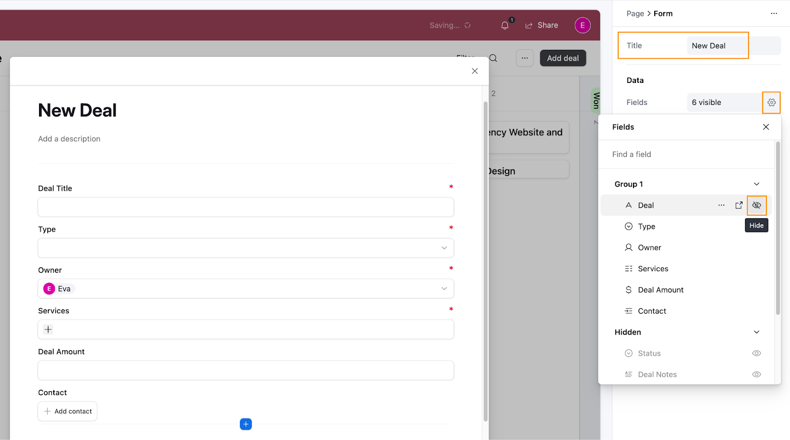
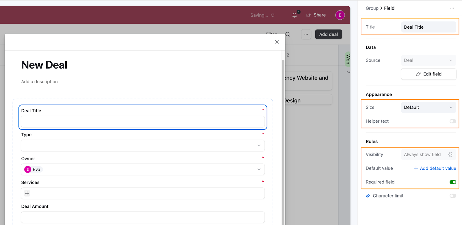
Next, click on the first field in the form (which allows the user to input the new Deal’s title) to open up Field settings. The settings might look a bit different depending on the field type you’re on. But overall, the structure is similar. You can define the title of the field, add a Default value, define appearance and help text, and set a field as required.
For simplicity’s sake, here’s how we set up our fields (follow the steps in the walkthrough above if you need more help setting this up):
- Deal Title: No default value; Required.
- Type: No default value; Required.
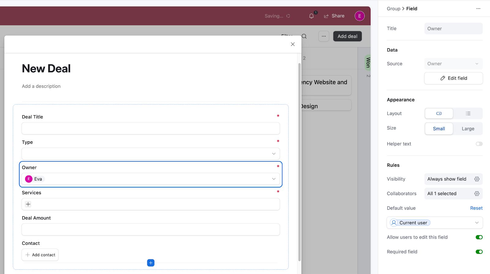
- Owner (the person that will manage the deal): Default value = current user (will dynamically set the owner to whomever submits the form); Required.
- Services: No default value; Required.
- Deal Amount: No default value; Not required (since you often won’t know the total deal amount when first adding it).
- Contact: No default value; Not required. (to avoid blocking the user from submitting the form if the Contact record doesn’t exist yet)
If you’d like, you can also update the button label and the message that pops up when the user submits the deal. This is useful for offering user feedback that the submission was successful.
Click outside of the field (for example, on the title of the form New Deal) to open Form settings. Under Submission options, update the Button label (for example, we updated it to “Create Deal”) and click the cog next to Message, then define your custom message (we set it to “Deal created”).
When you’re happy with your setup, close the form, and we’ll continue with setting up the Layout.
Configure the layout settings
To access the Kanban settings, click on the Kanban board. The next steps will be much like the steps you follow to set up a normal Kanban board in Airtable, but bear in mind that they don’t give users access to the base itself and using Interfaces you can better control how the data is presented to the user.
Let’s start by collapsing the Won and Lost columns. Over time, these columns can make the view busy, but collapsing them keeps things clean while still giving you a quick snapshot of how many deals were won or lost. If you filtered these columns out entirely, you’d lose that immediate insight.
- Scroll to the far-right side of the Kanban board.
- On the Won column, click Collapse stack.
- Do the same for the Lost column.
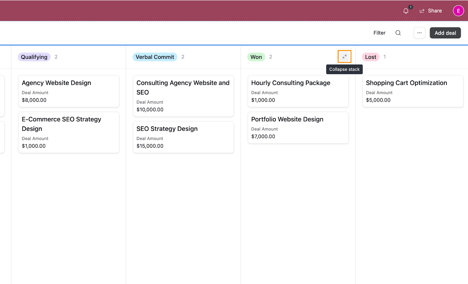
Here’s how your Kanban board will look now:
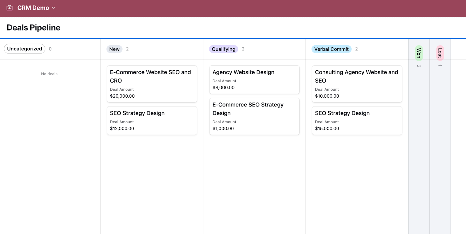
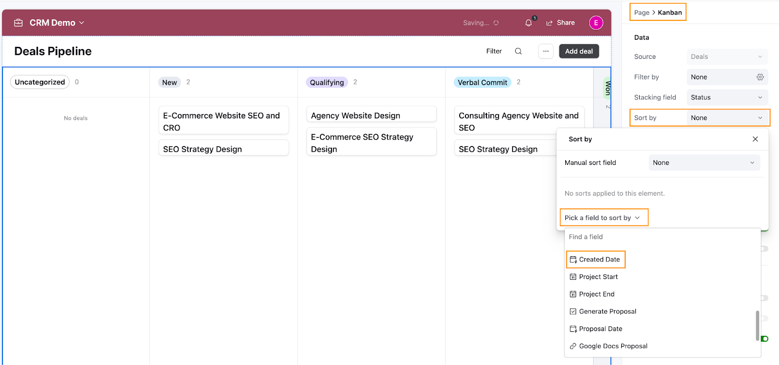
Since we’ve disabled users from sorting deals themselves, we’ll set up predefined sorting to make sure deals are prioritized properly.
- Click on the Kanban grid to open the Kanban board settings.
- Under Sort by, select the field you want to use for prioritization (e.g., Created Date). This will ensure deals are shown in the right order.
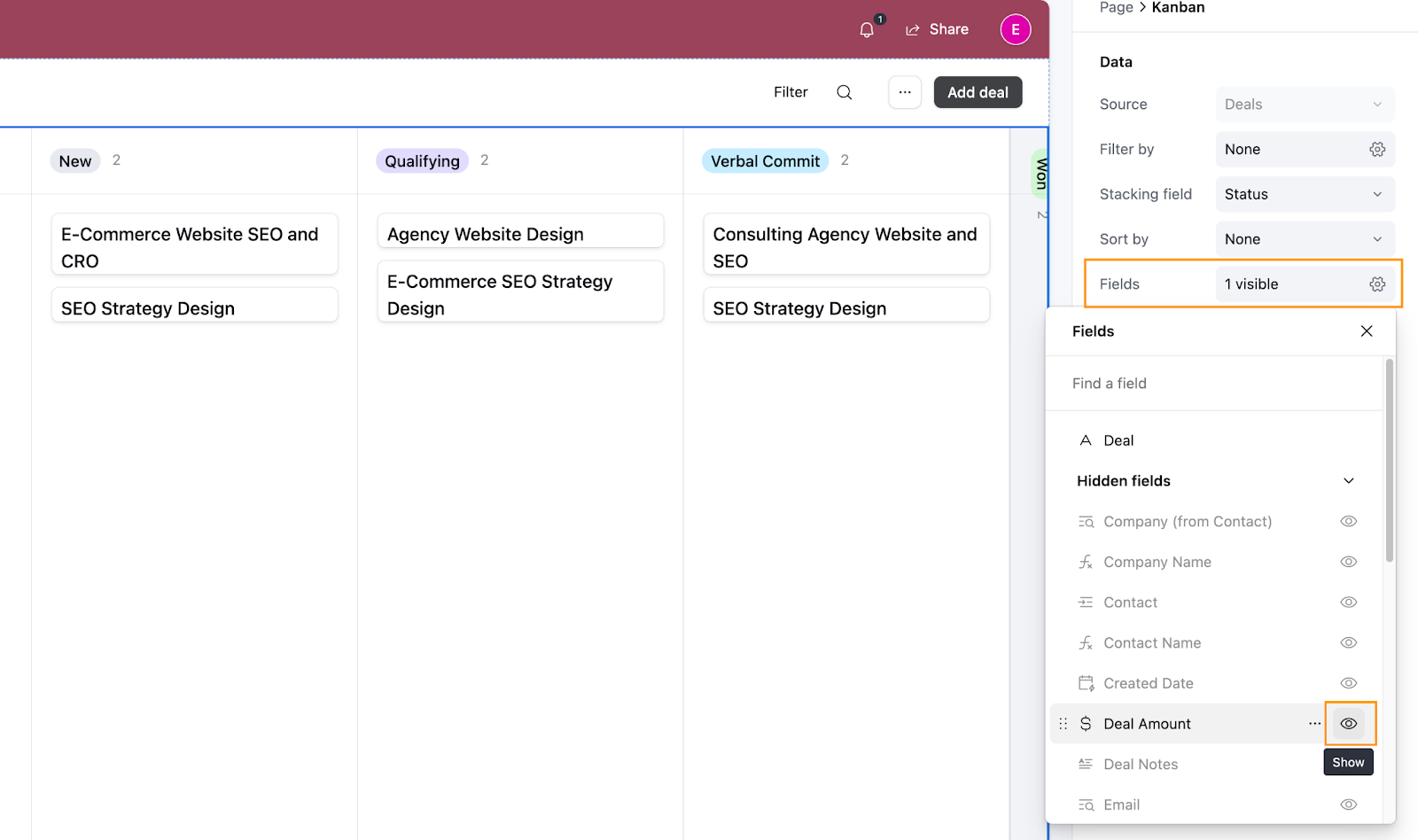
Next, let’s decide which fields should appear on the cards. This helps keep the information relevant and focused.
- In the Fields section of the Kanban settings, hover over a field and click the eye icon to show or hide it.
- Add or remove fields as needed to tailor the card view. We added the Deal Amount information to the card.
Lastly, toggle Wrap long cell values to yes so that you can see the full title of your deals, and toggle Click into record details to enable users to see additional information and edit it when they click into a deal.
This setting is especially useful if you want users to have view-only access and control exactly what information they can see. If you don’t want users to see more than what’s shown on the card, you can leave this toggled off.
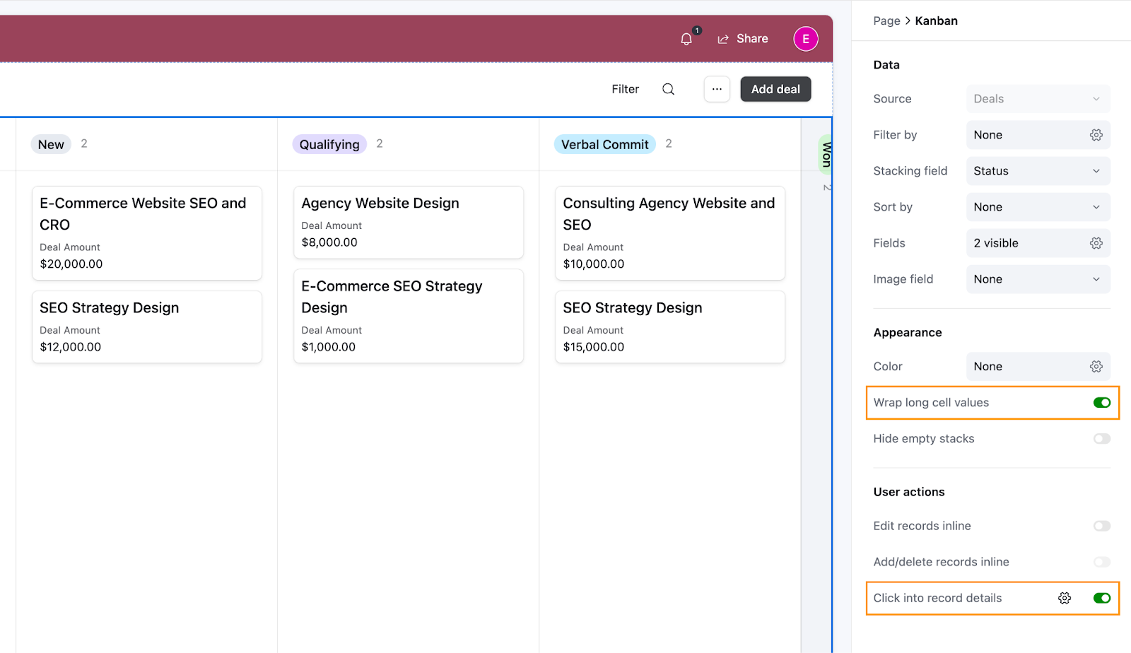
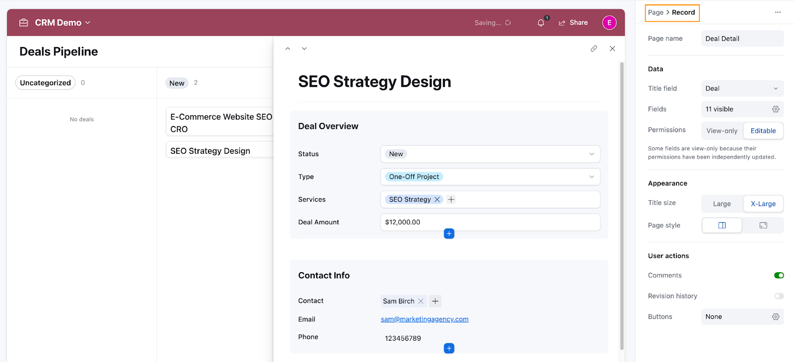
By toggling the Click into record details setting on, Airtable automatically generates the record detail page, where you can define which fields should be visible, group properties into sections (like Contact Info or Deal Overview), and customize how the data is displayed. This makes it easier to organize information and guide users on how to interact with it. We’ll set this detailed view up next.
Configure the record settings
Before we dive into the configuration, it’s important to keep one principle in mind: more flexibility doesn’t always lead to a better user experience. When configuring interaction points, like record settings, too much flexibility can introduce unnecessary decision paths, overwhelming users with choice. A simpler, more structured setup often creates a cleaner, more focused experience that’s easier for everyone to navigate.
When in doubt, aim for simplicity over complexity. For example, if a contact that should be linked to a deal doesn’t exist in your Contacts database yet, you may want to provide users with an obvious way to add it. This can be done in a few ways, like using a button or a form. To keep it consistent, we recommend sticking with one method; offering multiple options to complete the same action can create unnecessary decision paths and potentially confuse users.
So what can you actually configure on a Record? On the records page, you can set up record settings, field settings, and group settings (if you’ve grouped your fields). You can also add actions to your record or show related data in different layouts.
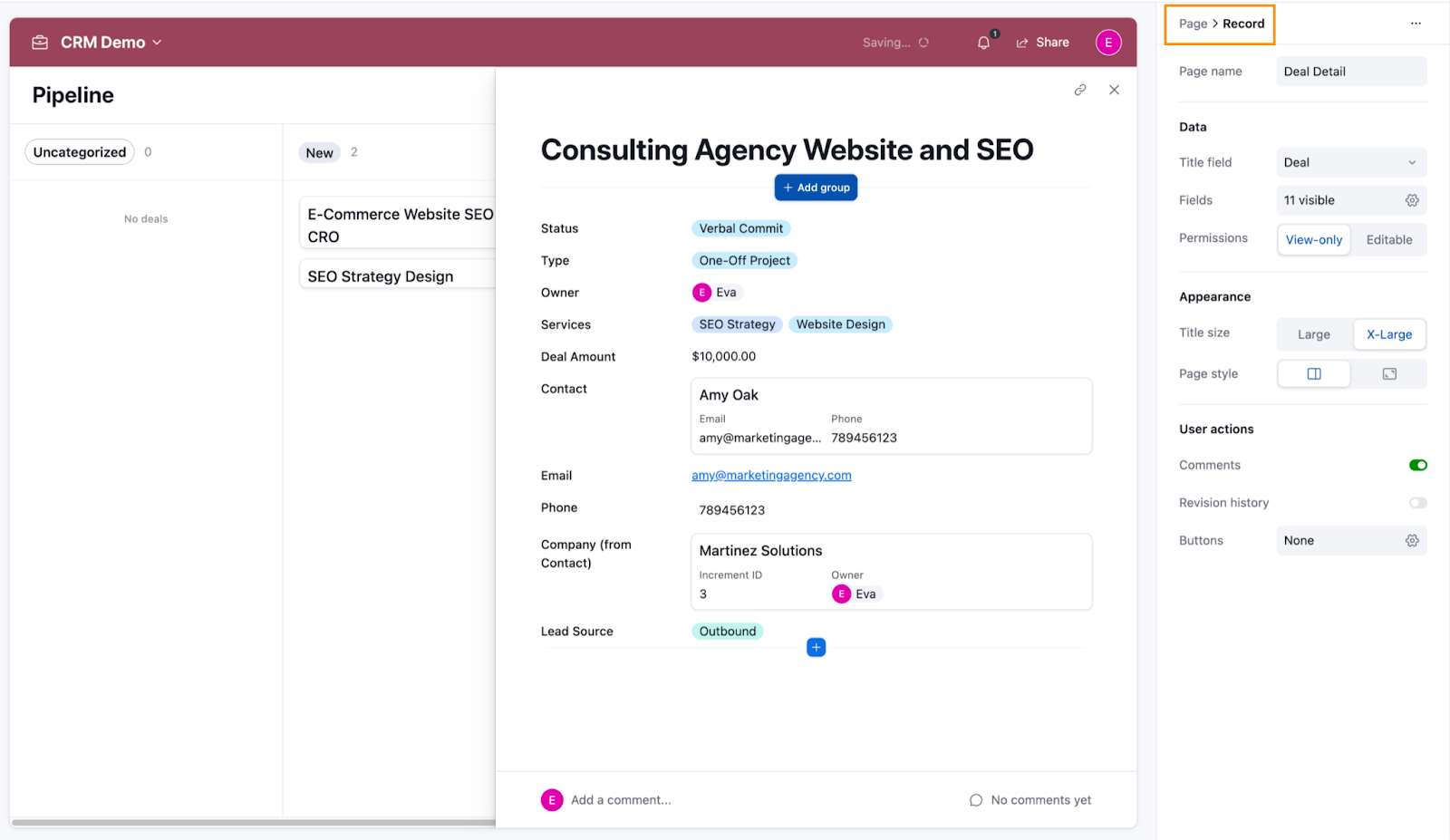
Let’s start with the ‘top-level’ configurations: the Record settings. Just like in the form and layout settings, you can control which fields are visible on the record page using the Fields configuration. Go to Data > Fields, click the cog icon, and use the eye icon to toggle the visibility of the fields you want to show in the record detail view.
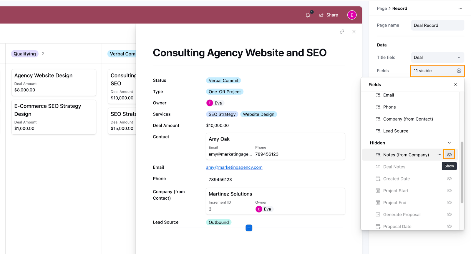
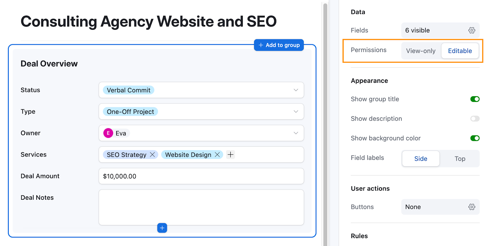
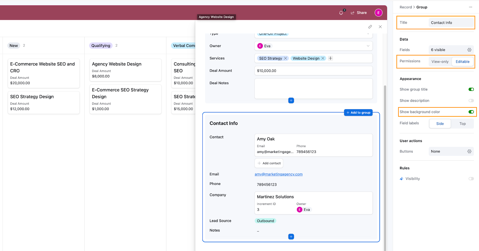
Under Permissions, you can toggle all visible fields to Editable, but some fields—like lookup fields (e.g., the Company field in our example that pulls data from the Contact record)—will remain view-only. Since we want to control our permissions on a more granular level, we’ll leave the default as view-only and define edit permissions at the group or field level.
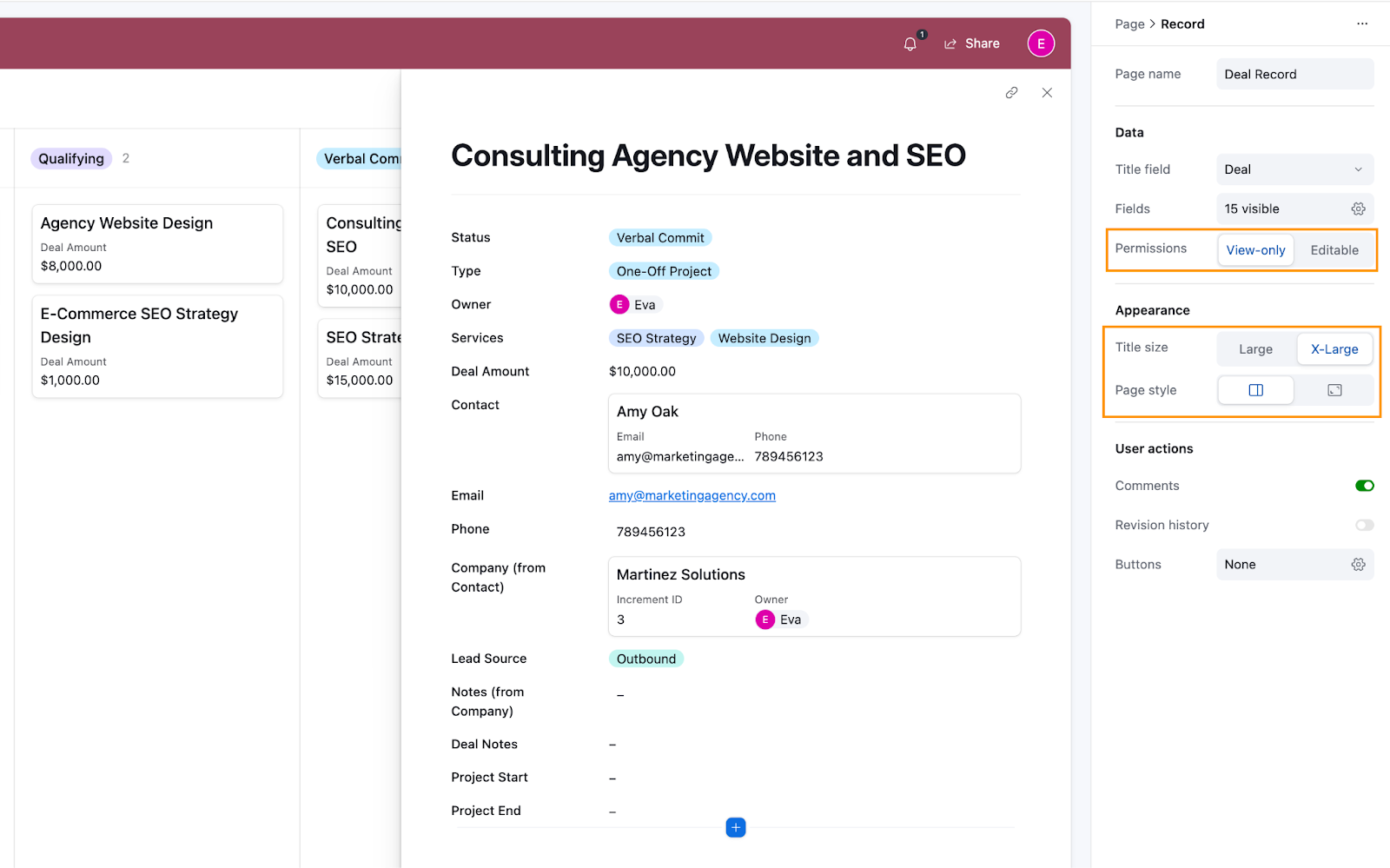
Under Appearance, you can adjust the title size and decide whether the record detail view opens as a side panel or a full-page view when a record is clicked on the Kanban board. Here’s how we configured it:
Now let’s organize our data into groups. This not only makes the data easier to digest but also allows us to manage fields more efficiently—such as applying settings like edit permissions to an entire group.
Configure Group settings
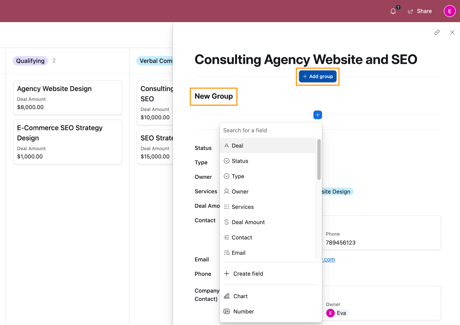
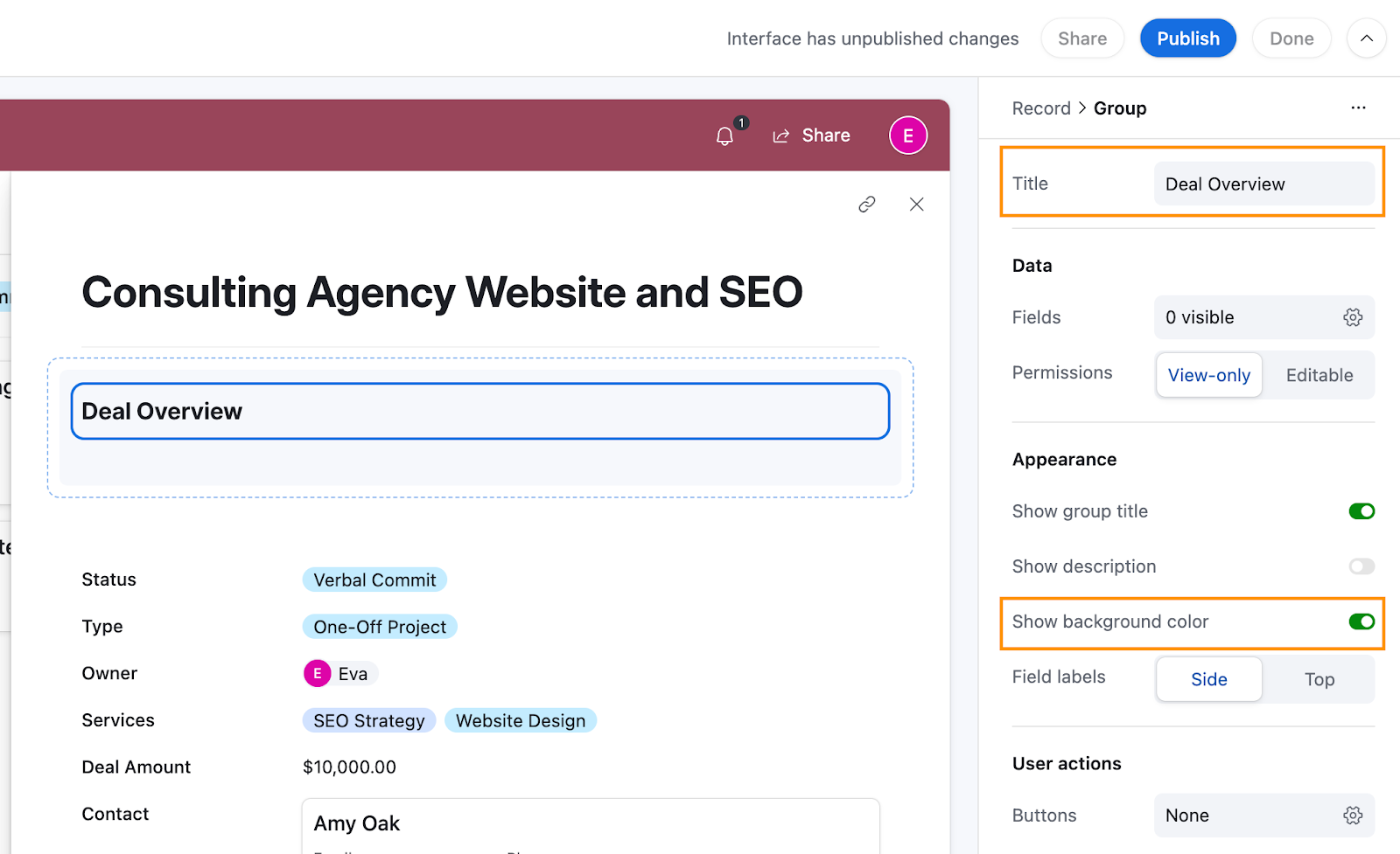
Hover just below the title section, and you’ll see a +Add group option pop up. Click on it to create your first group. You’ll notice it adds a section titled New Group by default.
Click on New Group to open the group settings. Under Title, rename the group “Deal Overview”. Then, toggle Show background color on to make the group stand out visually from the background, which can help make your data easier to read.
Now, drag all fields related to the deal into this group. Once everything’s in place, click on the group again and set Permissions to Editable. This makes all fields in the group editable (except for lookup fields).
Next, create another group and name it Contact Info. Repeat the process.
Depending on how your data is set up, you might need additional groups. Just repeat the steps above until your record view feels organized and intuitive.
Configure Field settings
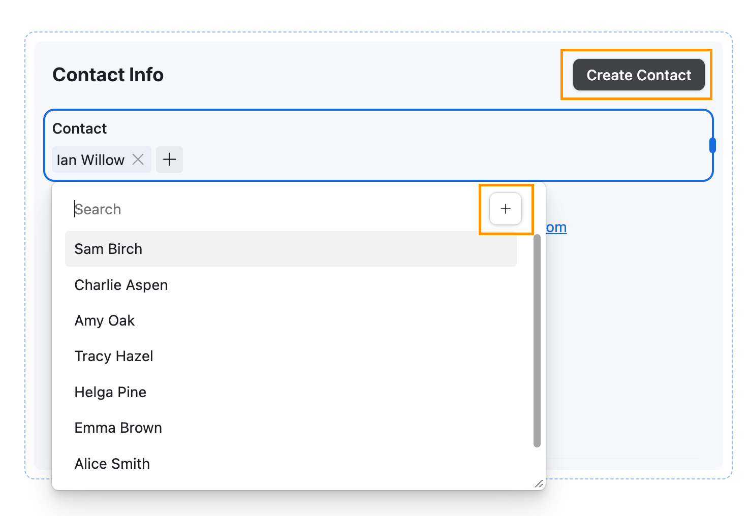
Lastly, let’s adjust how the Contact and Company fields are displayed. Since these are relation fields (more on these below), they come with a few extra configuration options compared to standard fields. You’ve already worked with field settings earlier on the New Deal form, so this should feel familiar. Here’s what’s unique about relation fields:
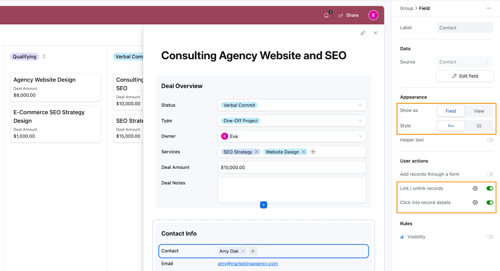
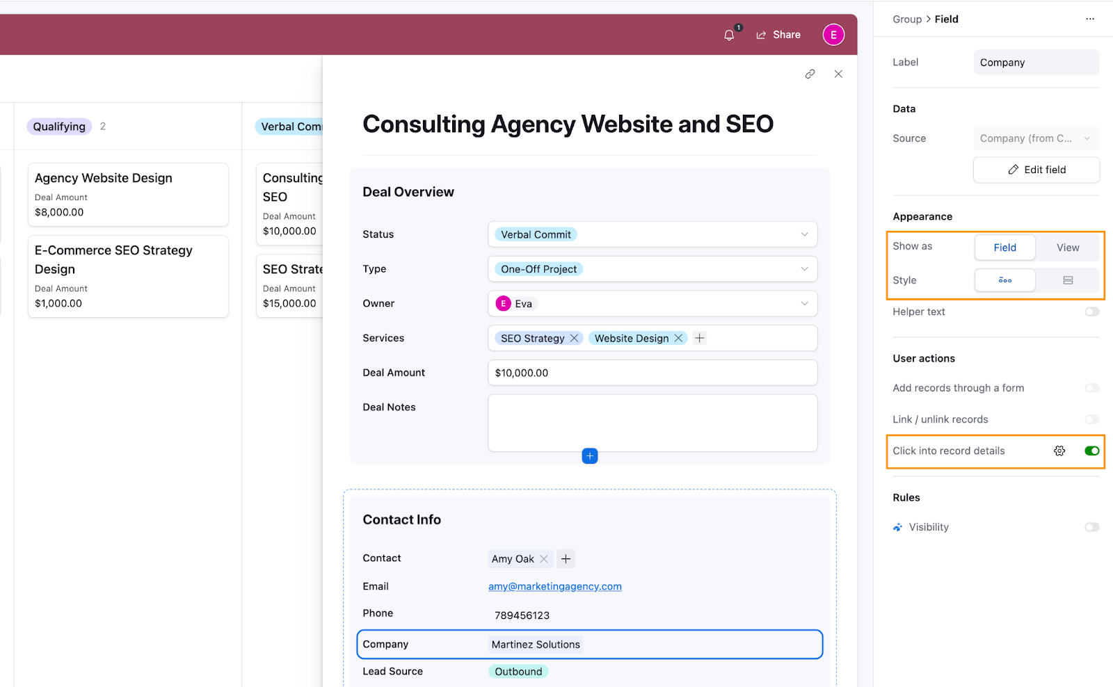
- Appearance: You can choose how the relation is displayed:
- Field or View: Decide whether to display the relation as a simple field or a more detailed view, like a table.
- Style: You can show the relation as a card (the current setup) or switch to a pill-style display (which we’ll do here).
- User Actions: These are similar to the settings we configured for the layout earlier, like whether users can add records through a form or click into the record details.
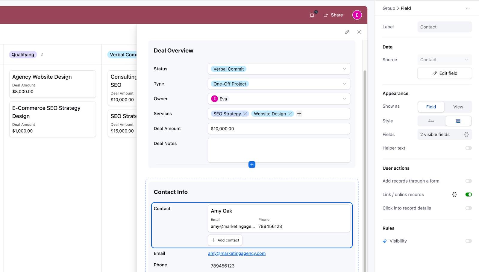
Here’s how we set up our Contact field:
And here’s how we configured the Company field:
Once you’re happy with how your fields look and function, go ahead and close the record.
Congratulations! You’ve just configured your first Airtable Interface!
Design your CRM Dashboard interface
A Dashboard is just another type of interface. It’s a great way to give your users a quick overview of essential or new data so they can make more informed decisions. So to design a dashboard, we’ll start by creating a new Interface.
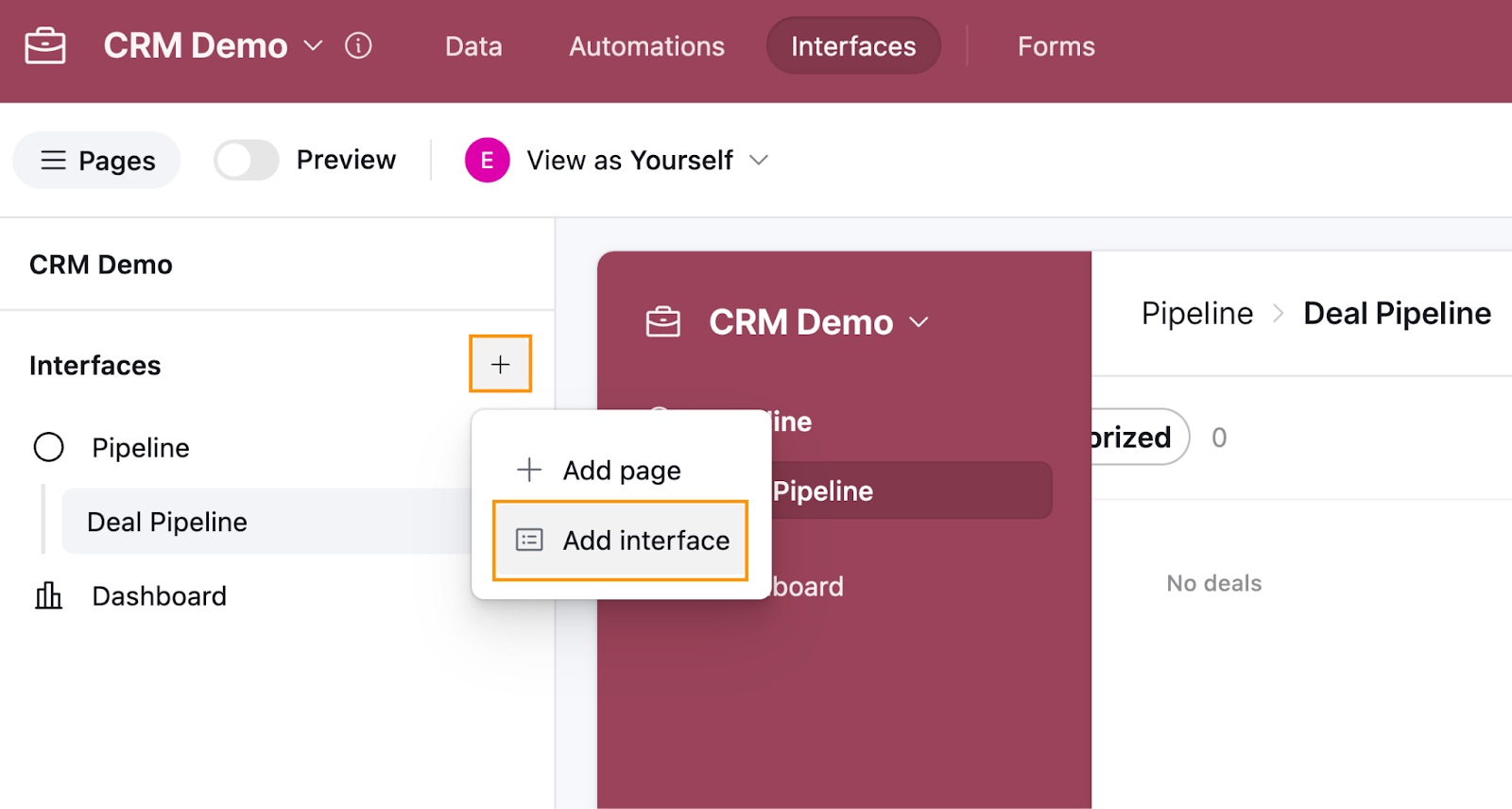
In the left-hand Interface sidebar, click on the plus sign, then:
- Select Add interface.
- Name the interface Dashboard.
- Select an icon, then click Next.
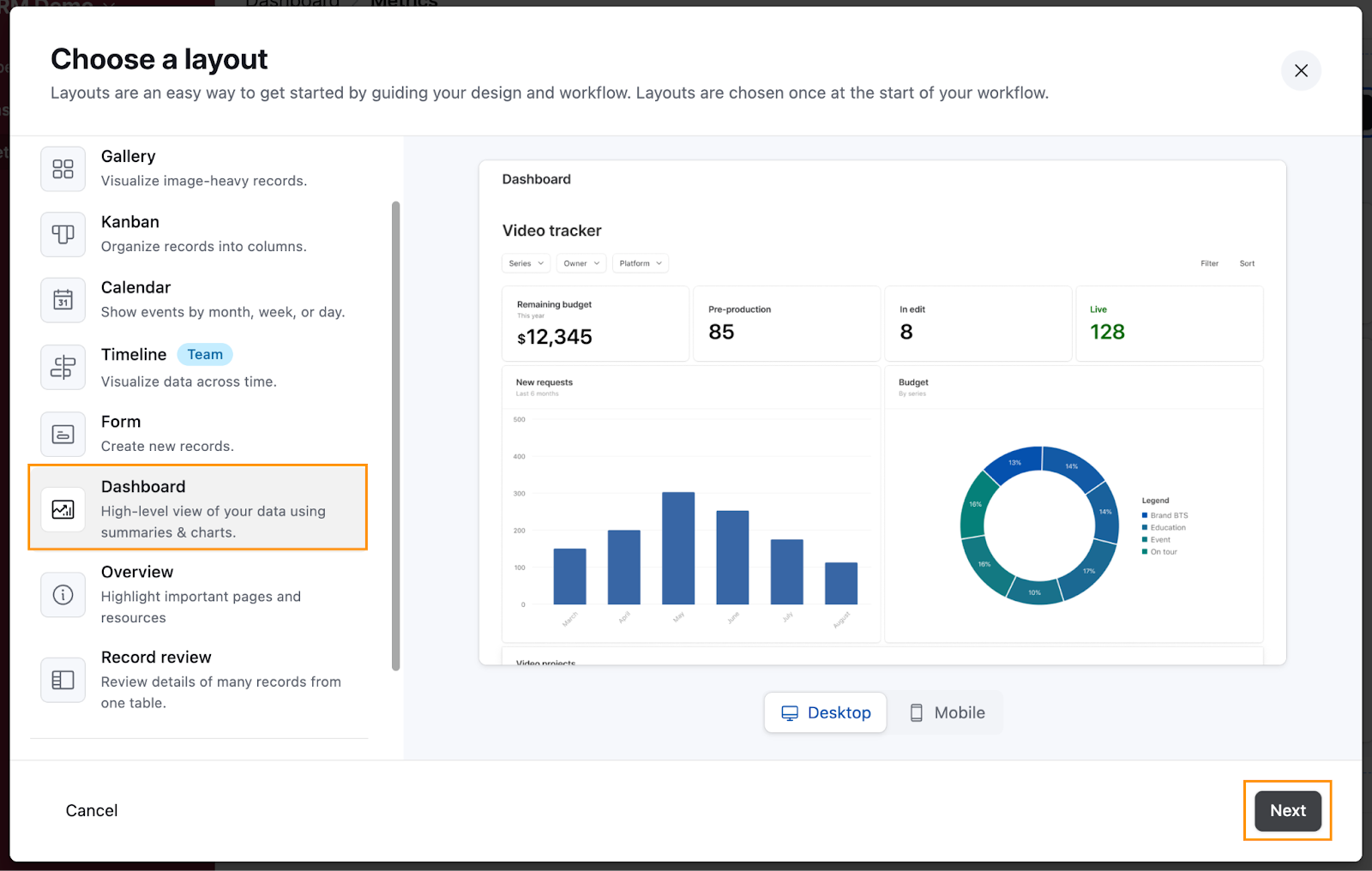
- On the next screen, select the Dashboard layout, then click Next.
- For the underlying table, select Deals and click Finish.
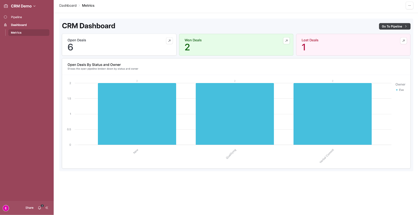
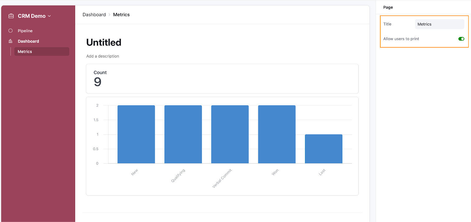
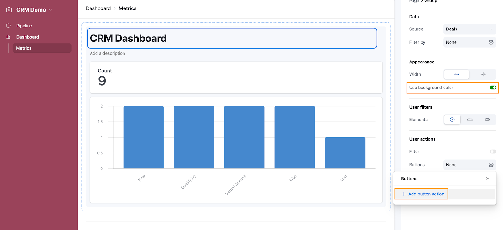
This will create a basic dashboard for you, and the default settings will open to Page settings. Rename the page title “Metrics” and leave the Allow users to print toggle on. This allows users to print the dashboard and share it with stakeholders without giving them access to the interface itself.
When your dashboard is generated, you’ll hopefully get some features automatically set up for you based on your data. In our case, Airtable generated a chart which counts the numbers of deals in each category.
Click on the Untitled section, which acts as the group title. In a dashboard layout, a group isn’t a collection of fields but rather a collection of elements like charts or numbers. Rename it to CRM Dashboard, and toggle Use background color on.
Finally, under User actions, click the cog icon under Buttons and select Add button action.
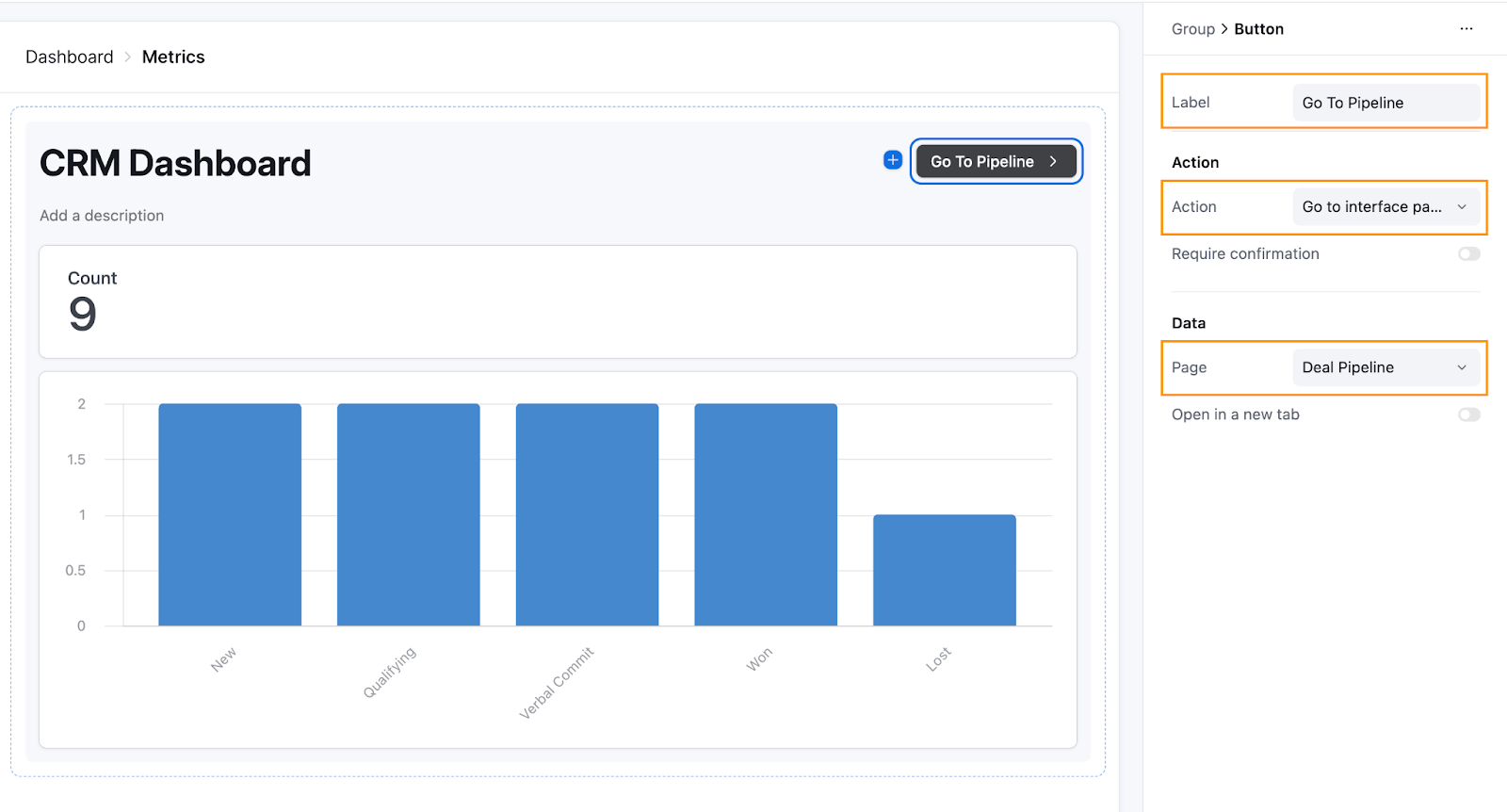
Set up the Action
Now that you’ve added a user action, a button will appear in the upper-right-hand corner of the group.
- Set the Label to Go To Pipeline.
- Under Action, select Go to interface page.
- Under Data, choose the Deal Pipeline page.
This button will let you quickly switch from the dashboard to your Deal Pipeline page, creating a seamless navigation experience between your interfaces.
Setup the Number configuration
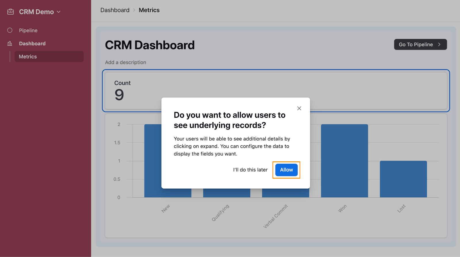
To set up the Number configuration, click on the Number element to open Number settings.
First, you’ll be prompted to define whether users should be able to see the detailed information if they click on the Number element (in this case, the count).
This means that if users click on the Number, they will be shown the breakdown of the records it summarized, in this case the list of deals. Click Allow to enable this feature, which is especially useful for stakeholders who need more detailed information without switching to operational views like the Pipeline page.
Once enabled, Airtable will open the Records view. Configuring this view is similar to setting up Layout settings, so you can follow the same steps again here.
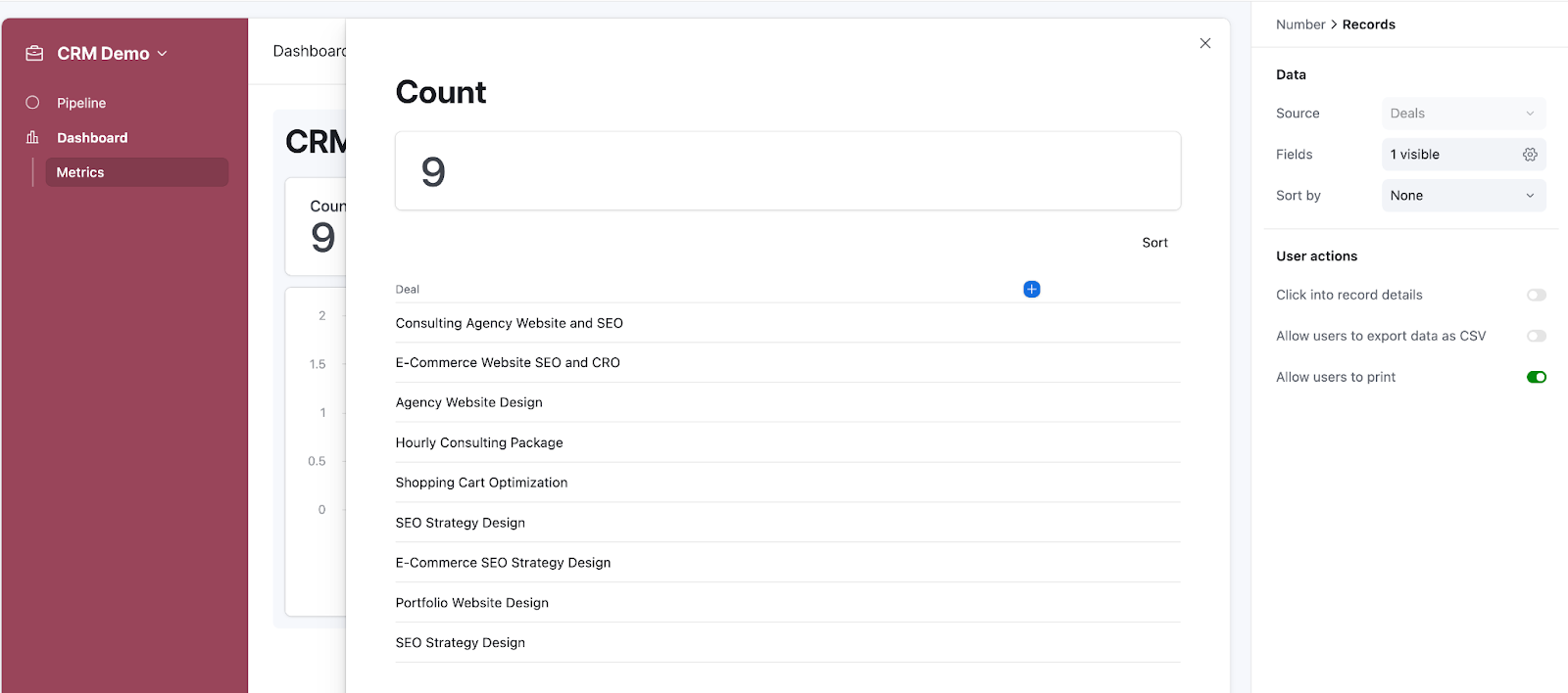
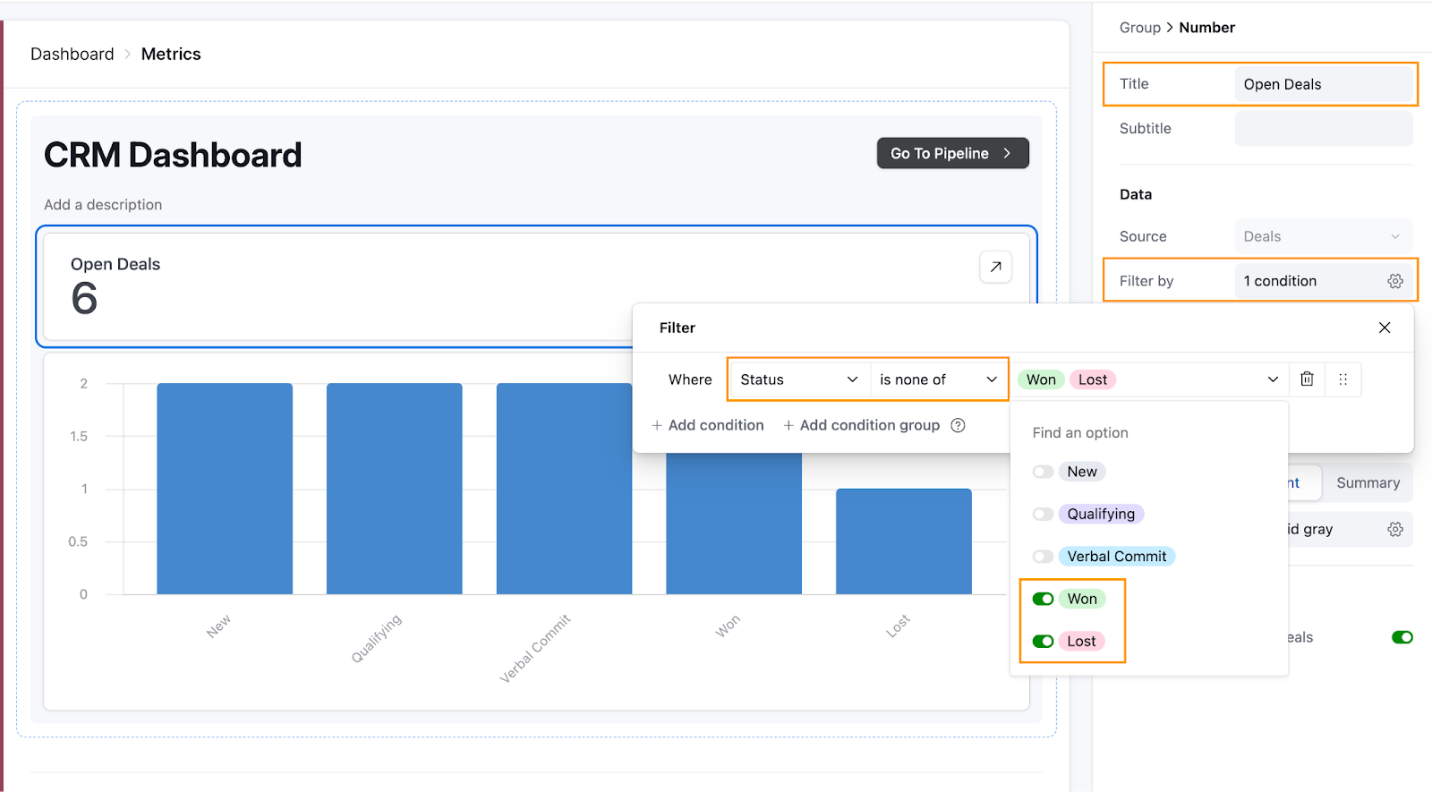
So that we don’t end up seeing a list of the hundreds of deals we might have saved in our CRM, let’s instead filter this Number to only count the Open deals, i.e. the ones that are not yet won or lost.
Under Number settings, set the Title to Open Deals. Under Filter by, configure the filter as follows: Status is none of Won, Lost.
Now, it’s easy to also summarize the total number of won and lost deals on the same page. Hover over the Number element, click on the three dots, and select Duplicate.
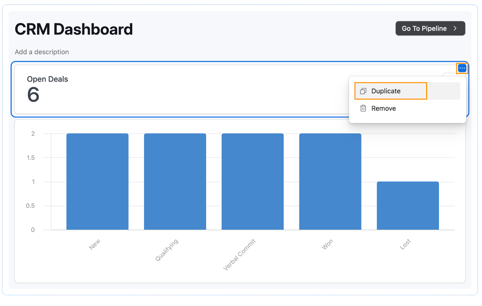
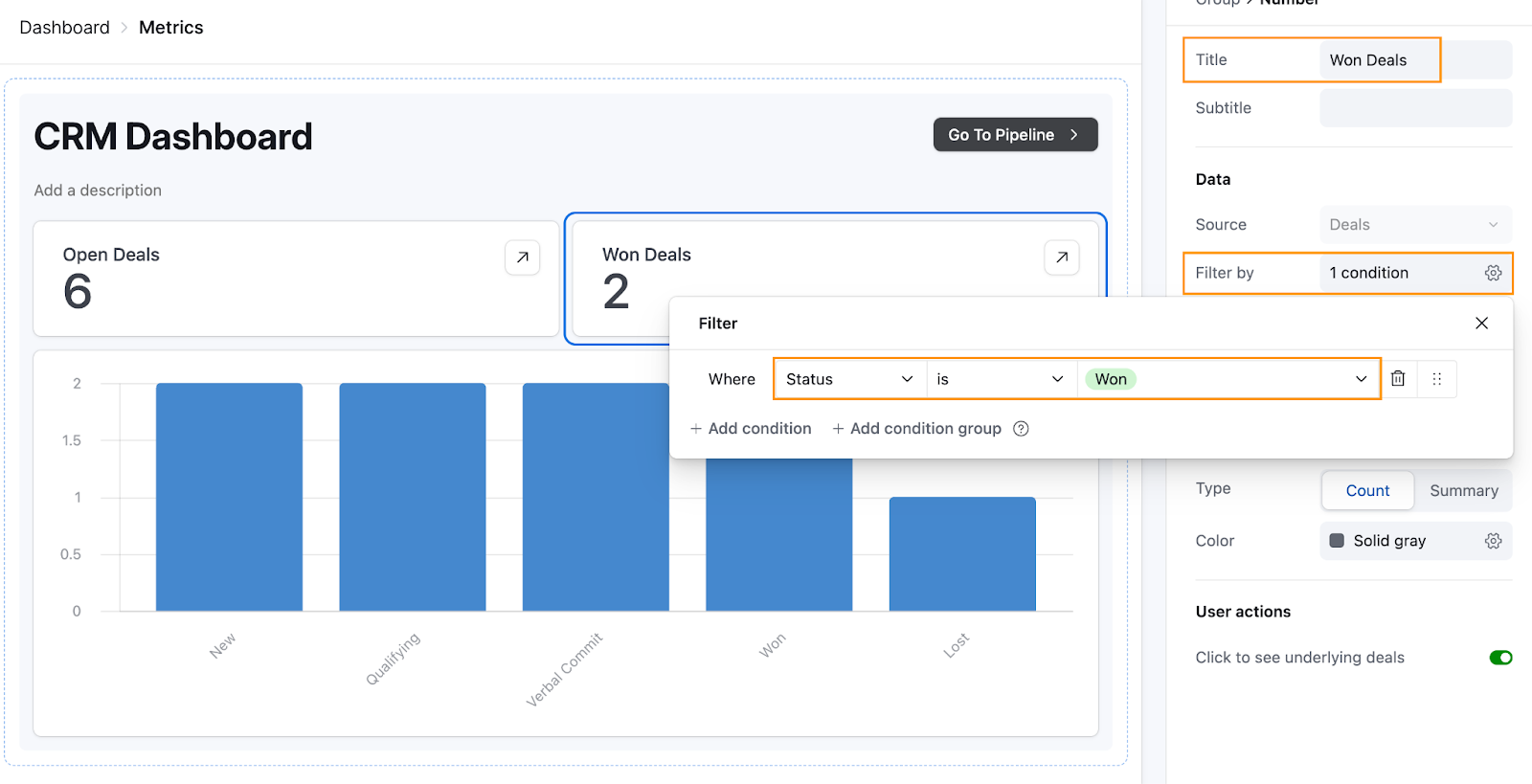
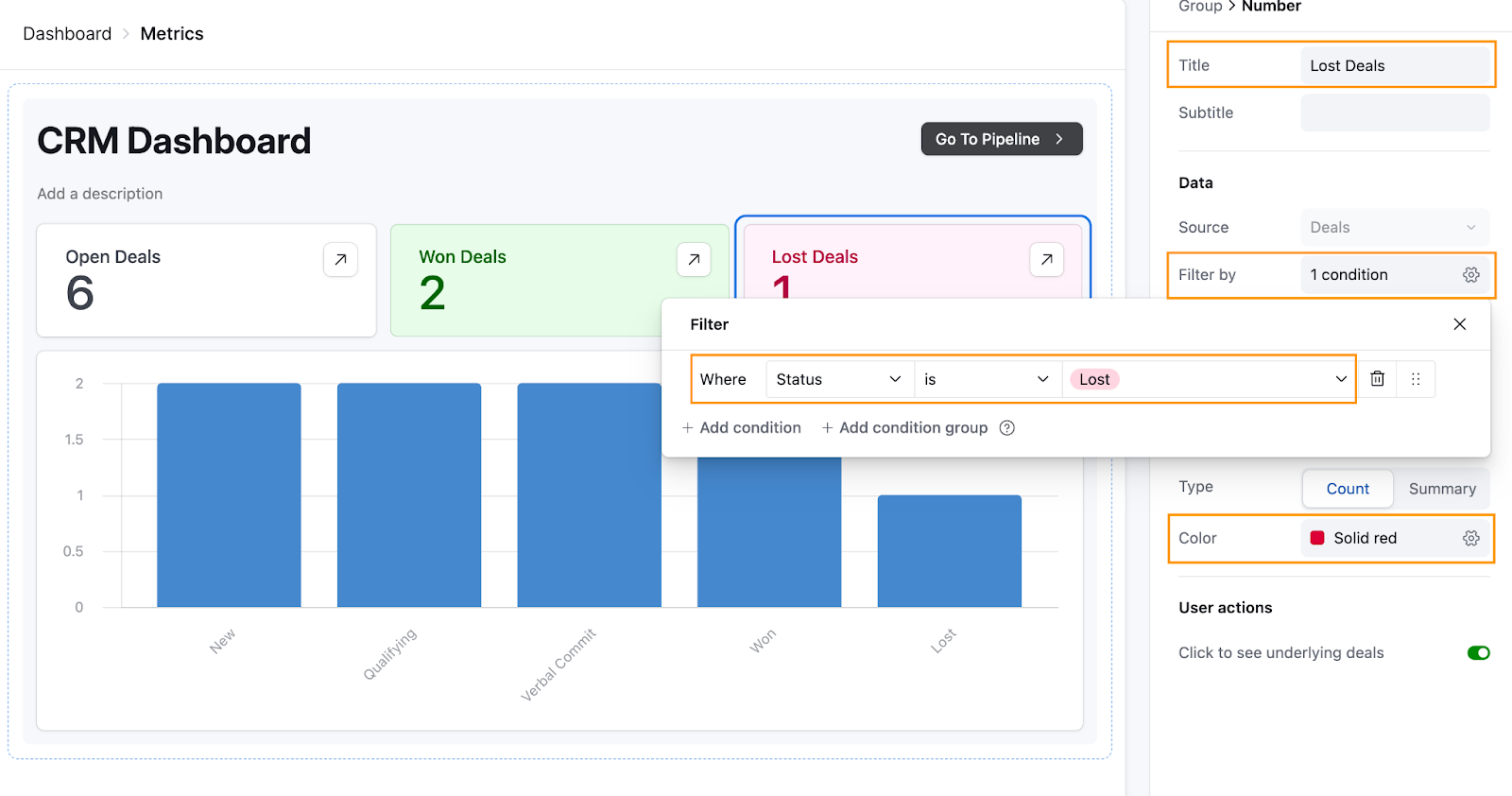
Click on the duplicated Number component, update the Title to “Won Deals”, and set the Filter by to: Status is Won.
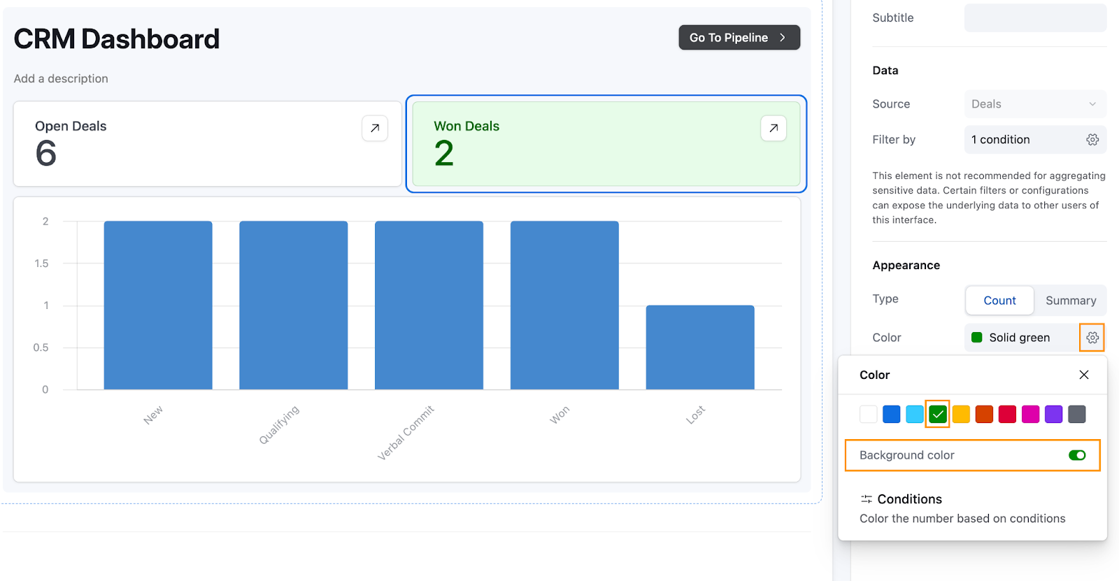
To make it visually clear that these are won deals, click Color, select green, and toggle Background color to on.
We’ll repeat the process for lost deals. Duplicate the Won Deals number, update the Title to Lost Deals, and set the Filter by to Status is Lost. Under Color, select red, and toggle Background color to on.
With this setup, you now have a clear high-level overview of your deals. Next, let’s customize the chart Airtable provided to show only open deals by Status and Owner.
Configure a custom chart
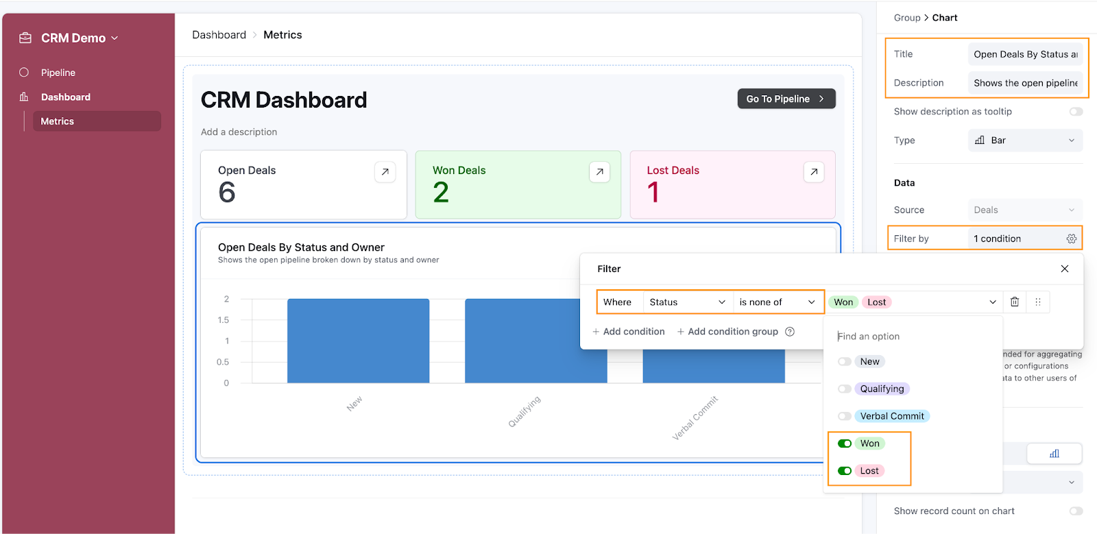
To customize our chart more, we’ll set it to show Open Deals by Status and Owner. Click on the chart to open the Chart settings pane.
Under Title, write a descriptive name like “Open Deals by Status and Owner”. You can also add a description to provide stakeholders with more context on what this chart represents.
Under Filter by, configure the filter to Status is none of Won, Lost to exclude closed deals, then close the filter settings.
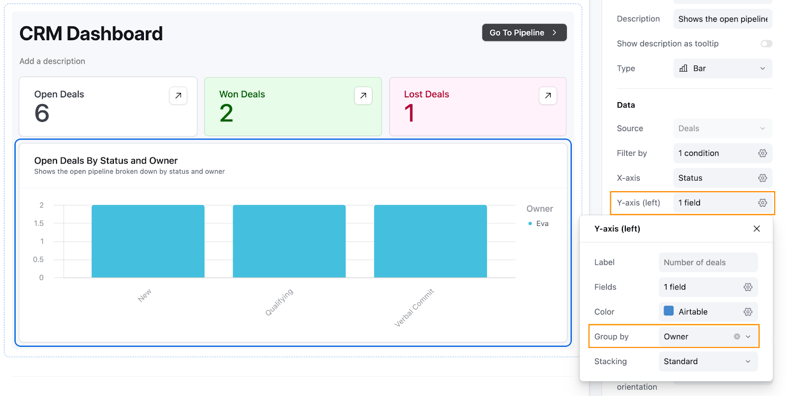
Next, under Y-axis (left), click on the cog icon and under Group by, select Owner. This groups each chart bar by deal owner, showing how open deals are distributed among team members. If you only have one owner in your data (like in our demo account), the chart might look the same as the original. As you add more owners to your deals, the chart will reflect this breakdown.
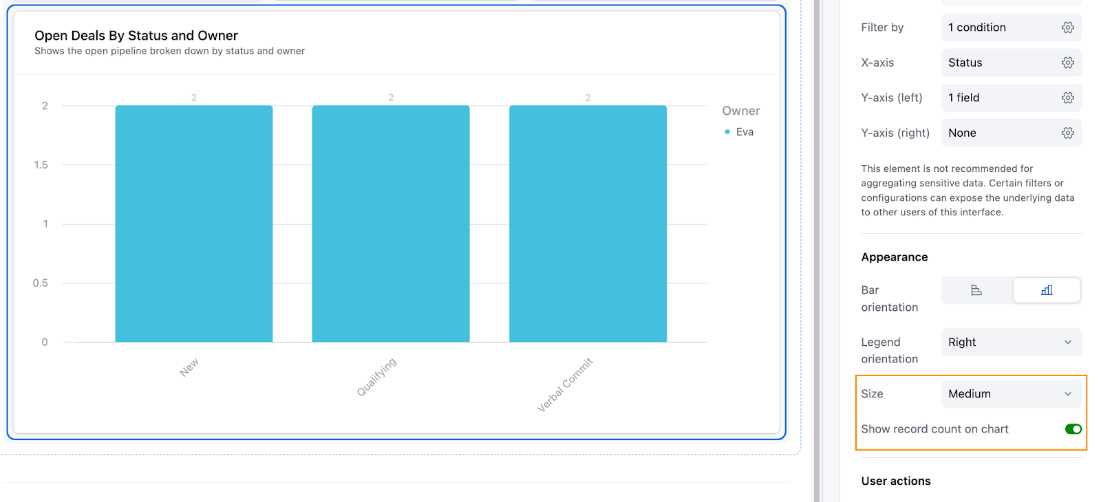
Finally, resize the chart to Medium to make it more readable, and toggle Show record count on chart to show the total number of deals above each bar.
And you’re done! The last step is to publish the interfaces so your users can access them.
Publish and share your interfaces
The process is super simple. In the upper-right-hand corner of your interface builder, click the Publish button. This will open a confirmation screen. Select both interfaces—Pipeline and Dashboard—and click Publish to make them live.
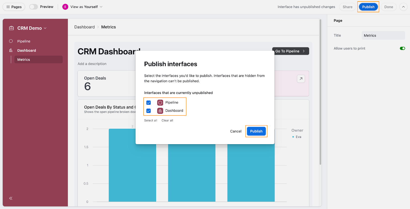
It’s important to keep in mind that whenever you make changes to your interfaces, they aren’t published automatically. You’ll need to republish the specific interface where changes were made for those updates to go live to end users.
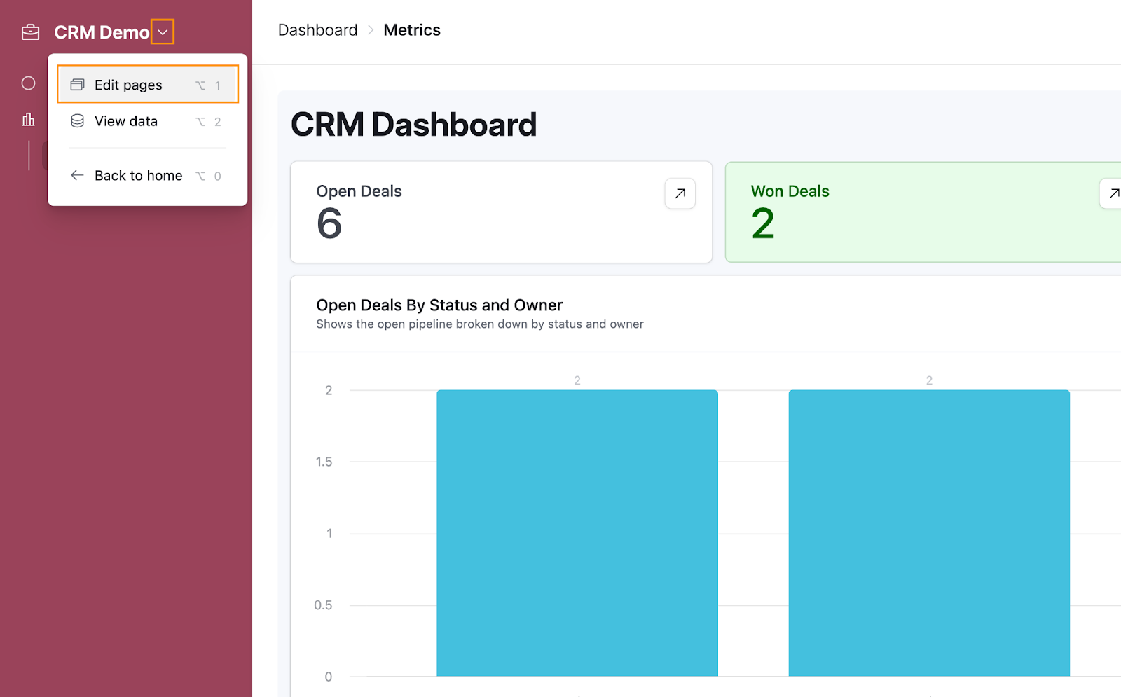
Finally, to share the interface internally or externally, click on the down arrow next to the title of your app and select Edit pages. This will take you back to the interface builder.
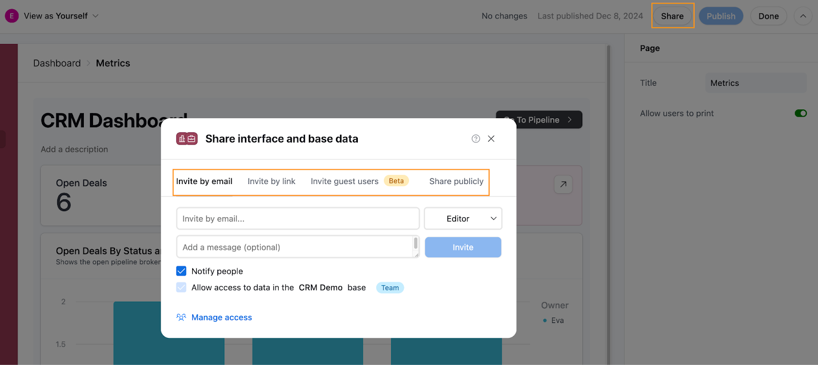
In the interface builder, you’ll see a Share button left of the Publish button. Clicking it will open a modal where you can invite users by email, share a link, invite guest users (a feature currently in beta), or even share publicly. Since Airtable’s documentation provides detailed instructions on sharing interfaces, we won’t dive into the specifics here, but feel free to check out their guide for more information.
Conclusion
In this tutorial, you've taken your Airtable CRM to the next level by building tailored Interfaces that make interacting with your data more intuitive and actionable. From setting up a Deal Pipeline, to designing a CRM Dashboard, you've learned how to create focused views and layouts that surface relevant information while keeping the user experience clean and organized. These Interfaces allow your team to navigate and manage data more effectively, whether it’s tracking deals, analyzing metrics, or presenting insights to stakeholders.
If you're looking to expand your CRM further, consider building additional Interfaces for managing Contacts and Companies. Since the process mirrors what we demonstrated in the Pipeline interface, you already have the knowledge and skills to set these up with confidence.
Stay tuned for future tutorials where we’ll dive deeper into building tools with Airtable. Until then, happy building!

