

Google Sheets is often the go-to tool for storing and managing simple and small datasets due to its simplicity and accessibility. But, what if you’re looking for something more interactive, with enhanced functionality, larger storage, a cleaner user interface, and better control over your data and most importantly who can edit or delete it?
Surely to build something like this you need to be an expert coder?
The answer is, no. There are now many more no- to low-code product builders out there that allow you to build just that without any need to code. With products like Glide, you can turn your Google Sheets into fully functional mobile and web applications without needing to write a single line of code. Glide is an app-building platform that enables you to quickly build prototypes, MVPs (Minimum Viable Products), and Proofs of Concept much faster than traditional coding methods. If you don’t know anything about Glide yet, start here at our What is Glide article.
In this guide, we'll walk you through creating a basic CRUD (Create, Read, Update, Delete) application using Glide, all powered by your Google Sheets data. This app will let you manage your data in a secure and intuitive way from any device, providing control over adding, viewing, updating, and deleting records. No coding experience is required, and, by the end of this tutorial, you’ll have a sleek and functional app, ready to handle your data efficiently and securely.
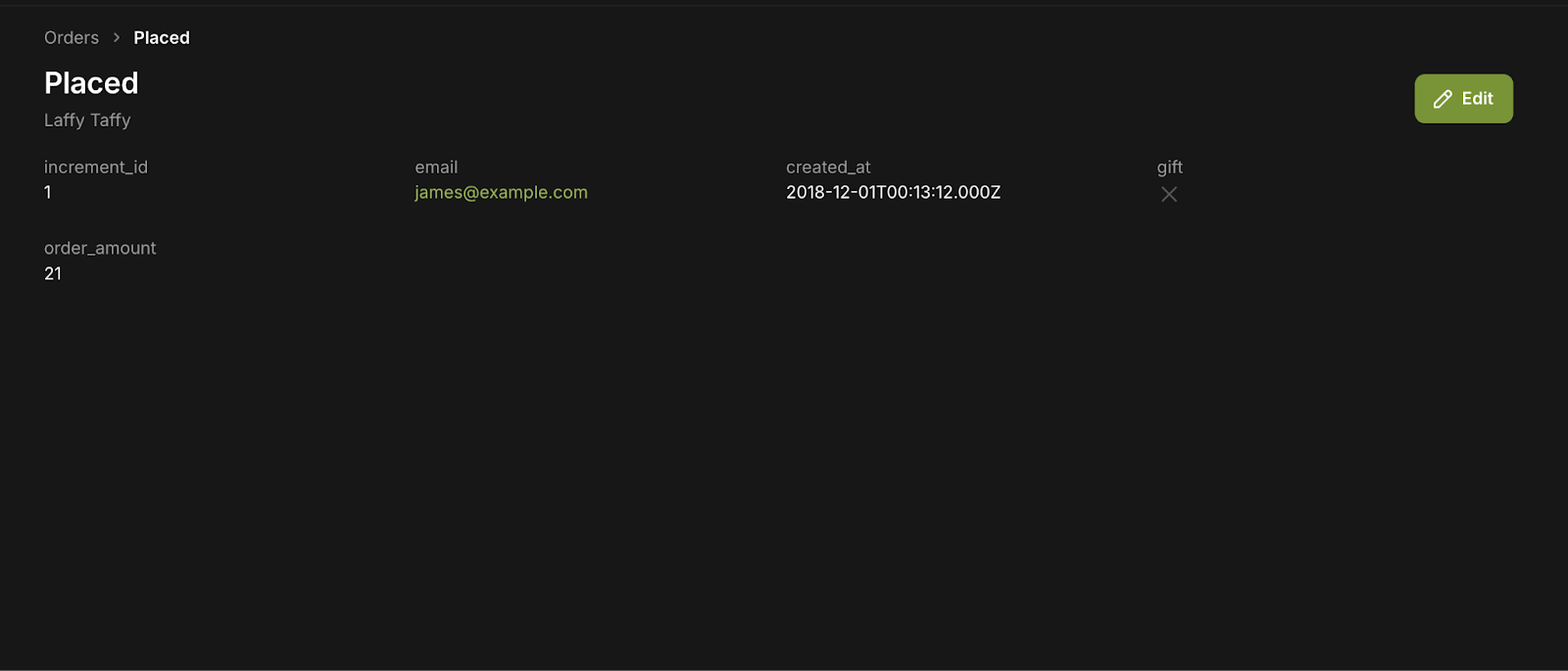
Here’s a preview of what our final app will look like:
Why should you use Glide to build your Google Sheets applications?
While Google Sheets works well for organizing data, it lacks the ability to create more dynamic, interactive apps. Glide bridges this gap, enabling you to turn your spreadsheets into functional applications that look great on any device.
Using Glide for a simple CRUD app on top of Google Sheets enhances your application's security, scalability, and customization options. This setup offers a more efficient and collaborative way to manage your data compared to using Google Sheets alone.
Here are some ways that Glide offers an upgrade from using Google Sheets for your internal business software:
Create applications with better data security, without code
Glide allows you to prototype and build applications, such as MVPs or internal tools, much faster than traditional coding. Google Sheets can serve as your app's backend, while Glide generates the user interface, transforming your data into a mobile-responsive app. This makes it easier to develop simple yet more secure apps, like internal dashboards, without needing development or extensive technical knowledge.
More control and customization
Compared to the basic features in Google Sheets, Glide offers greater flexibility in designing app interfaces, managing user roles, and interacting with data. For instance, you can create and customize forms, buttons, and lists to interact with your data beyond what Google Sheets can offer. Glide also allows you to set permissions, reducing the all-too-common threat of accidental data loss or manipulation.
Integrations, automation, and scalability
Glide integrates with various tools and includes an automation designer (Action Editor) to automate your workflows. Currently, automations need to be user-triggered (for example, with a button), but Glide is working on upgrades and features like scheduled workflows and more advanced automation capabilities similar to Zapier. As your application grows, Glide can handle larger datasets (up to 10 million rows), addressing the scalability limitations of Google Sheets.
Improved user experience across devices
Glide apps are mobile-friendly by design—arguably, they offer one of the best mobile builders in the no-code space—ensuring your application looks clean and functions smoothly on different devices. Unlike Google Sheets, which is restricted to a table-based layout, Glide offers a more app-like, user-friendly experience with custom interfaces that adapt to your needs.
You can read more about Glide in our full platform guide.
Now that you have a sense of how Glide can upgrade your Google Sheets data into an actual application, let’s dive into our practical example!
1: Set up an account with Glide
To begin, you'll need to set up an account with Glide. Click Open Glide in the upper right corner of their page. This will take you to a registration screen where you can sign up using your Google account or email.
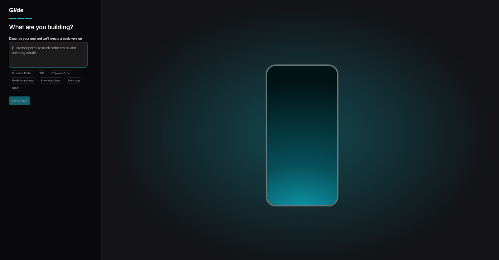
During the account setup, Glide will walk you through a series of questions and prompt you to create a new app. There’s no way to skip this step, so you can either select one of Glide’s predefined options or create a custom app from scratch. This process will also introduce you to Glide’s AI builder, which you can access from your dashboard.
Once the setup is complete, Glide will generate a basic app for you in the app builder, complete with sample data and an initial interface.
Since we’re focusing on building an application using your Google Sheets data, you'll first need to return to the main dashboard of your Glide account. To do this, simply click on the Back to Dashboard button located in the upper left corner of the app builder.
2: Connect Glide with Google Sheets (or another data source)
Once your account is set up and you're on your main dashboard, linking Glide to Google Sheets is relatively straightforward. To make things even easier, we’ve prepared a sample Google Sheets file for you with some demo data to match our tutorial.
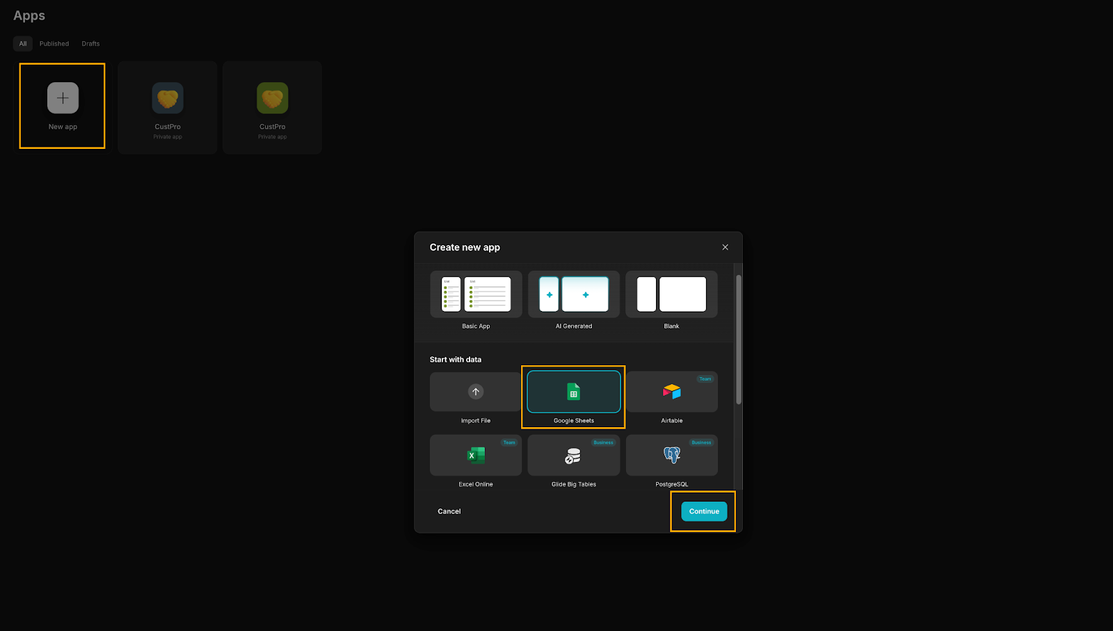
Now, in your dashboard:
- Click on New App
- Choose Google Sheets
- If you're using the Free Account, choose Import Google Sheets (Glide also offers a free 30-day trial for premium features)
- Connect to your Google account using the Google authentication process.
- When prompted, select your Google Drive file from the list or search for it and click Select.
If you have any trouble with Google Authorization:
- Download the provided Google Sheets file directly to your device as a csv.
- Click on New App.
- Choose Import file.
- Click Choose a file.
- Find and upload the file you downloaded.
Regardless of the method you use, Glide will create a sample app from your data and take you back to the app screen, giving you a solid starting point.
When you land in the app builder, you’ll see three tabs at the top of the page: data, layout, and actions. In Layout, you’ll build your UI. But before building out the UI, for now let’s get a closer look at our data tab.
3: Enrich and organize your Google Sheets orders
Now that your data is connected, let’s make sure all the columns are formatted correctly, and then take it a step further by adding some extra columns and functionality. First, switch to the Data tab in the top bar.
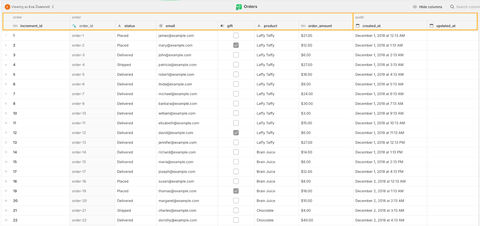
When you open the data tab, you’ll notice two databases in the left sidebar: the one imported from your Google Sheets and a Users table automatically generated by Glide. You can also add new tables here (which we’ll get to shortly). At the bottom of the sidebar, you’ll see the data sources your tables are connected to and the center pane displays your data, along with options to browse, configure, and manage it. At the bottom of this section, you’ll find options like "Show API” for the table, 'export data’, and a widget linking to Glide Docs.
Select the Orders table from your database. To format the `order_amount` column as currency:
- Find the ‘order_amount’ column
- Click on the dropdown arrow next to the column header
- Select Edit from the menu that appears
- In the Units section, enter your currency symbol (e.g., $)
- Make sure ‘Display units after number’ is unchecked so the symbol appears before the number
- Click Save.
This will format your ‘order_amount’ column to display currency, making your data easier to read and understand.
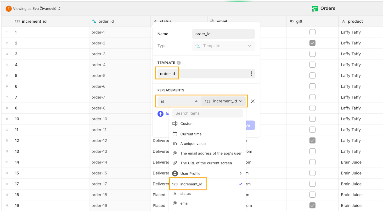
Next, it’s important that our data rows each have a unique ID so that we can easily refer to them in our apps. To do this automatically within our data tab, let’s add an order_id using a Template column. Add a new column, name it “order_id”, and set the column type to ‘Template’. In the TEMPLATE section, write “order-id” and in the ‘replacements’ field, write id. Click on the three dots on the right side of the ‘Custom’ field, select increment_id, and then click Save. Now, each order row will have its own automatically generated unique ID.
And lastly, for even better data integrity, let’s add a field to track when an order was updated. Create a new column, name it “updated_at”, set the Type to ‘Date & Time’, and click Save.
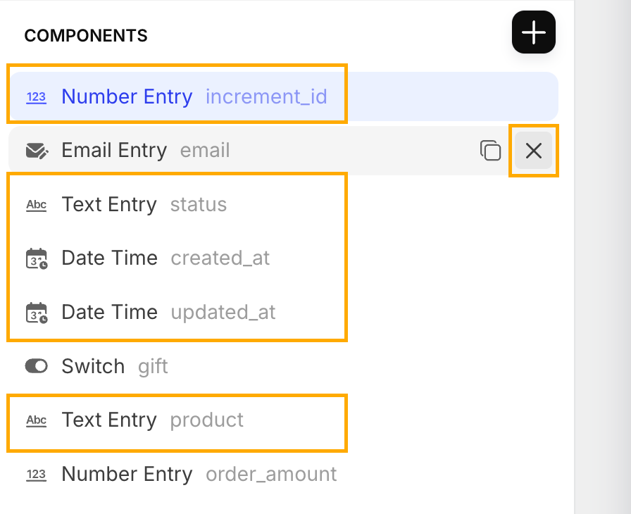
Now, to keep things organized, we’ll group the columns into two categories: order and audit. This feature helps us organize the data by combining multiple columns under a common header, making it visually easier to understand and manage related information. This is especially useful when working with large datasets or complex tables. Additionally, when configuring components, you’ll see that your grouped columns are neatly stored in folders, reflecting the categories you’ve created. This makes building the UI far more efficient than scrolling through a long list of columns.
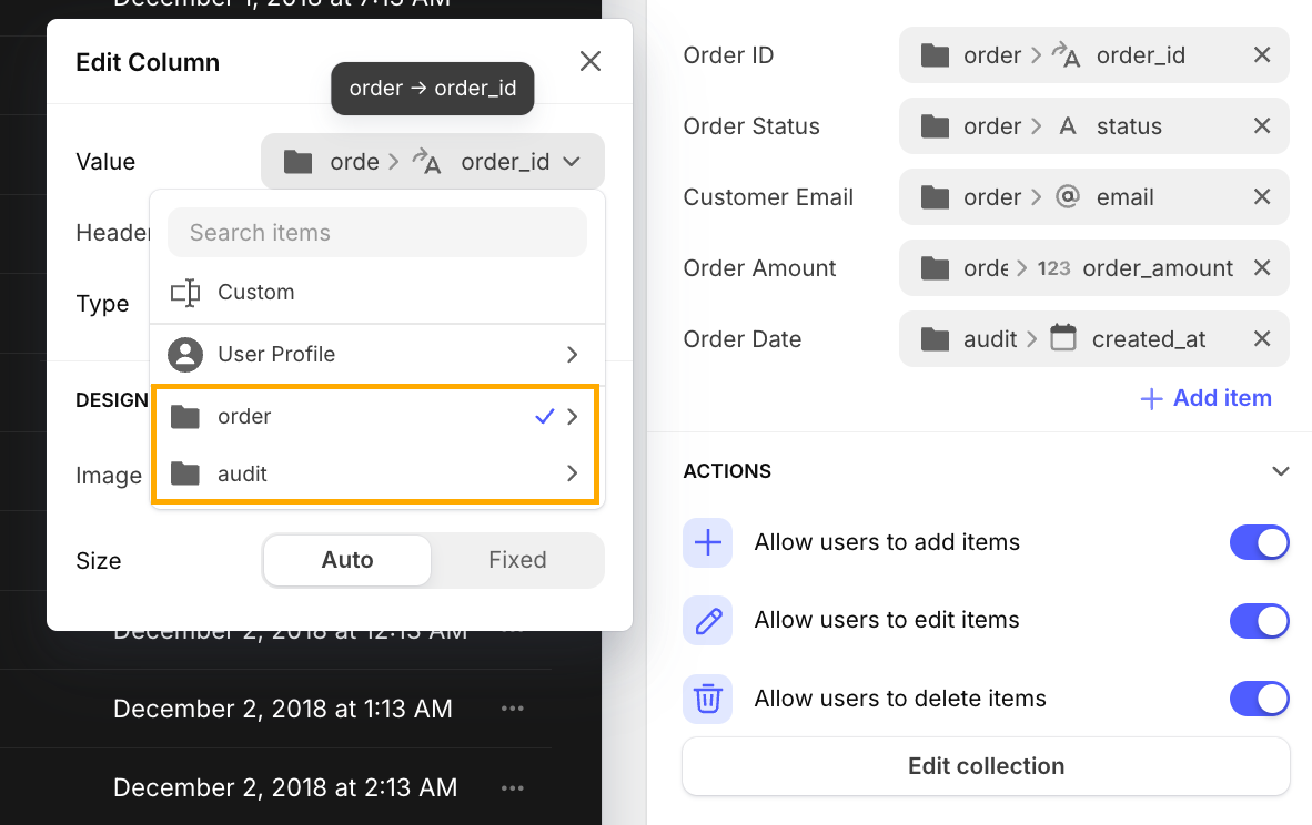
To set up the groups, click on the dropdown arrow next to any column header, select Edit, and then prefix the column name with the group name, a slash, and the column name (e.g., “Order/ColumnName”). Repeat the process for all columns as shown below. For more tips on using the Glide Data editor, check out their documentation.
4: Automatically generate the next order ID
As we mentioned, it’s important to have unique IDs for each record (row) in your table. To prevent having to manually assign order IDs, let’s automate this process with a simple coding trick.
First, head over to the Users table, create a new column and set its type to ‘Single Value’. For the Get option, select Last (this pulls the last record in the table). In the From dropdown, choose 'Orders’ > ‘order’ > ‘increment_id’. This configuration now retrieves the latest increment_id from your Orders table, which we'll use to generate the next ID. Click Save to finalize this setup.
Next, add another column and select Math as the type. In the CONFIGURATION section, enter “last + 1”. This formula ensures that each new ID is sequentially incremented from the most recent one. Set the Precision to 0 decimal points, uncheck Use group separator (a formatting feature that adds delimitors to large numbers to make them easier to read), and click Save.
Using this method, you automatically generate unique increment IDs based on the last value. This approach simplifies the process and minimizes the risk of manual errors, ensuring that each order has a distinct and accurate identifier.
5: Create user roles
Before we move on to building the app interface, there’s one more step in the Data editor that we need to complete, creating two different user types in our app so that not everyone has the same permissions to edit or delete (we all know that one person who needs to be locked out…).
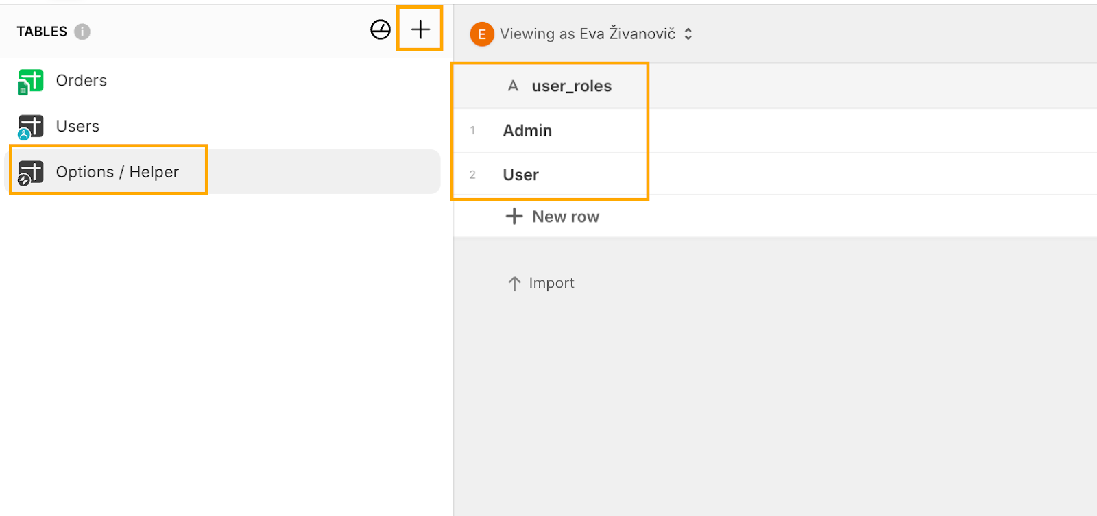
Start by creating a new table. To do this, click the plus sign in the Tables sidebar to add a new table. From the dropdown menu, select Blank table. Now, when you create a new table in Glide, it will initially be named with a placeholder name (in my case "brainy-earth"). To ensure that you can easily identify the table's purpose, rename it to something more descriptive, like "Options" or "Helper" as we’ll use this table to store select values for our UI components such as user roles. To do so, simply click on the table’s name and enter the new name.
In this table, rename the first default Name column to user_roles. Add two rows to this table: type Admin in the first row and User in the second row. This setup will help us manage user roles later in the application.
It’s as simple as that! With our "backend" data structure now complete, we're ready to start building the user interface for the app.
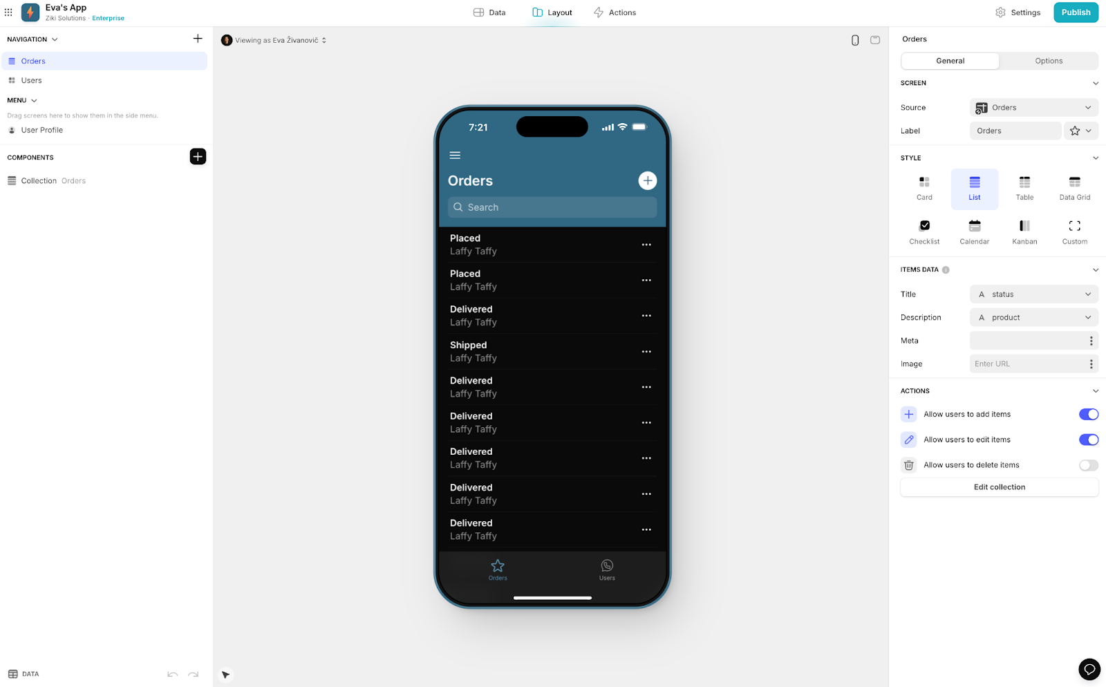
6: Set up the Orders table interface - ‘Read’
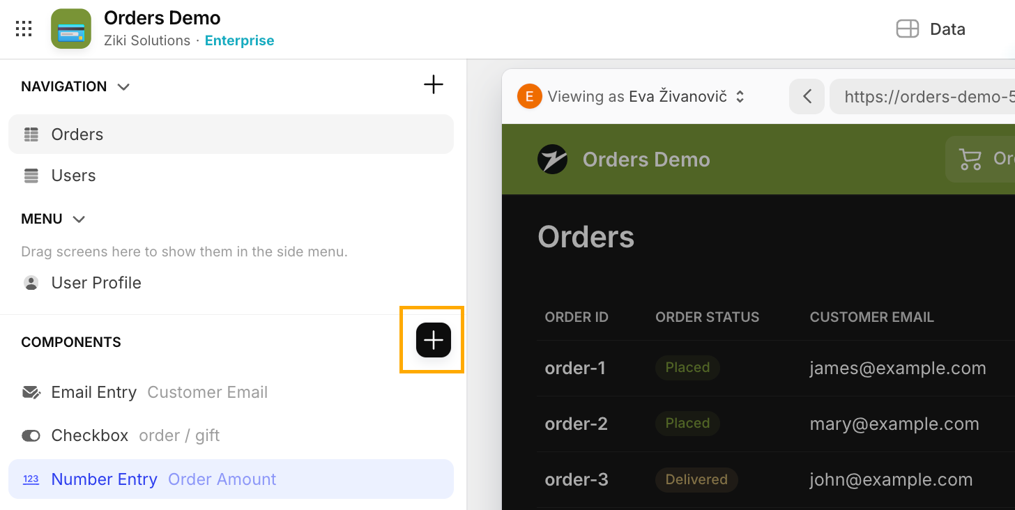
Let’s start by putting the ‘R’ in CRUD: Read. To start customizing the layout, select Layout from the top bar.
On the left-hand side of the Layout tab, you'll find the navigation and components tree settings. This area allows you to configure your app tabs and manage which components are visible on your screen. When you select a component, a configuration bar will appear on the right side of the screen, providing you with options to adjust the details and properties of the component. The central area of your screen displays the app screen itself, where you can preview how your app will appear on both desktop and mobile devices in real-time. This live preview helps you see how your changes affect the overall design and functionality of your app.
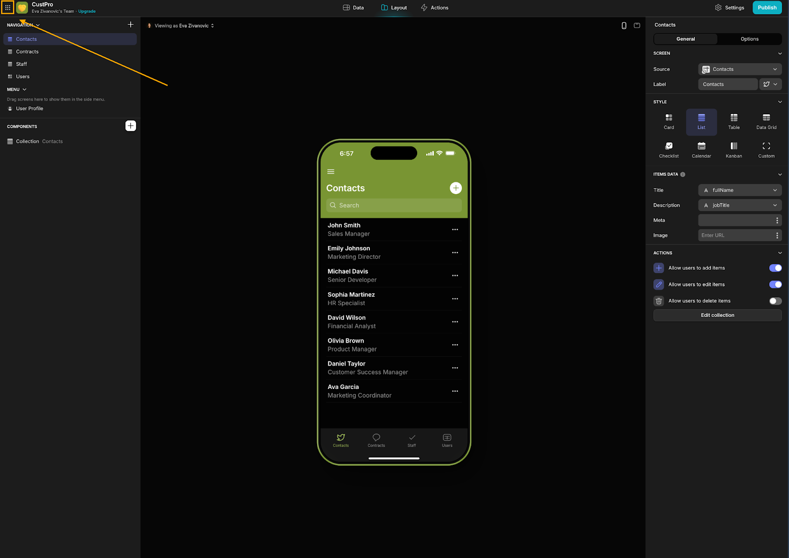
Glide by default creates a list view of your data, but for orders, a table view is more appropriate. To switch to a table view, click on the ‘List’ component in the Components tree on the left side of your screen. Then, under Style in the component configuration on the right, select Table. Enter “Orders” in the ‘Title’ field to label your table.
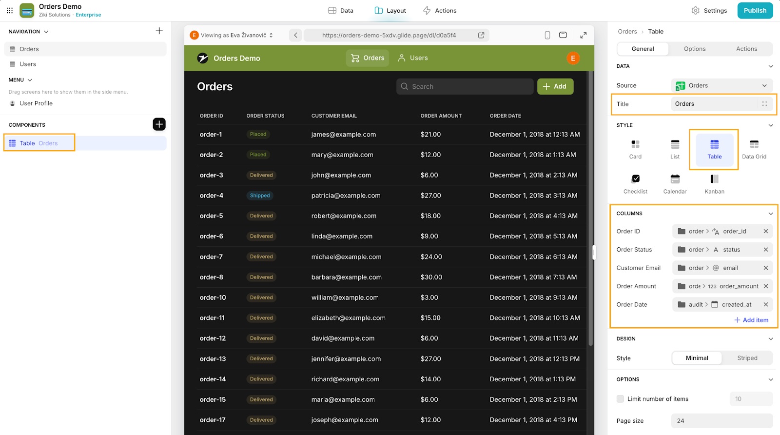
To adjust the columns you’re displaying in the table, you can delete any unnecessary ones by clicking the X next to their names under ‘Columns’. And to add new columns, click Add item.
By default, the labels of the columns will match the names in your underlying database. To update a column's name or value, click on the column label (for example, ‘order_id’) and:
- Under ‘Value’, select the column it should point to
- Under ‘Header’, update the label
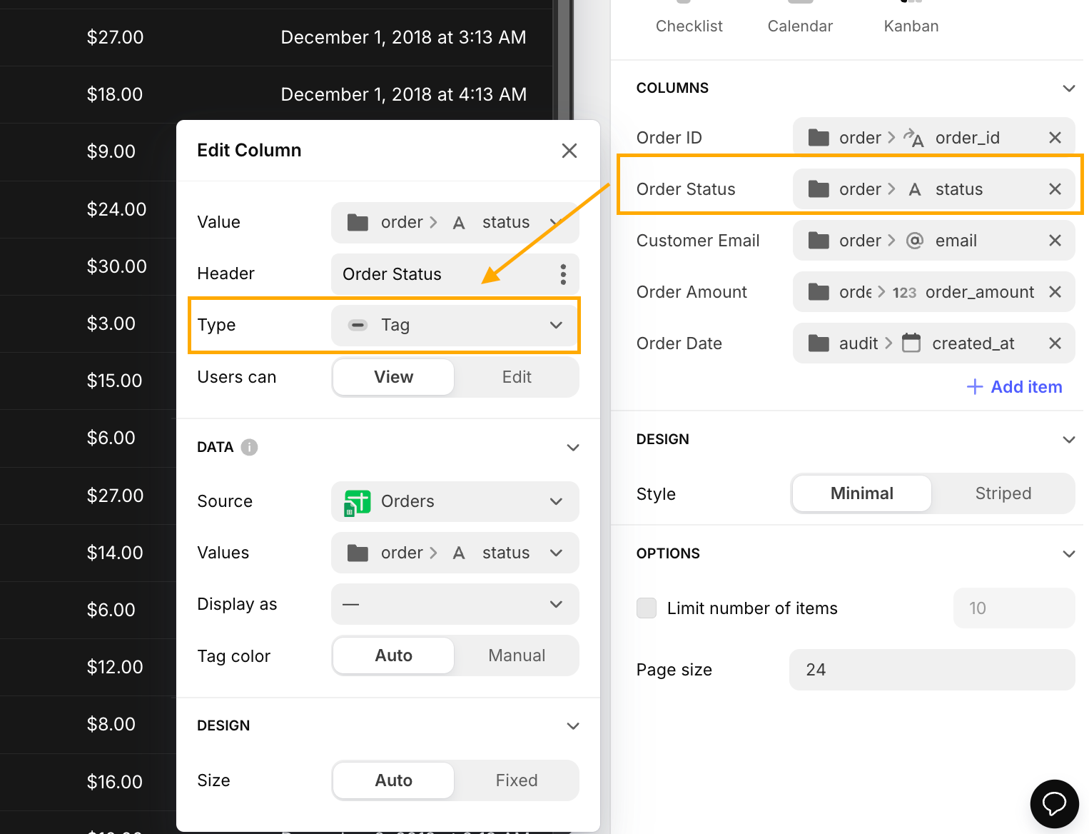
For our table, leave the 'Type' of columns on 'Auto' for all columns except for the 'Order Status' column. For 'Order Status', choose ‘Tag’ instead. This will create colorful tags for your statuses, helping you easily differentiate between the various stages in the order process.
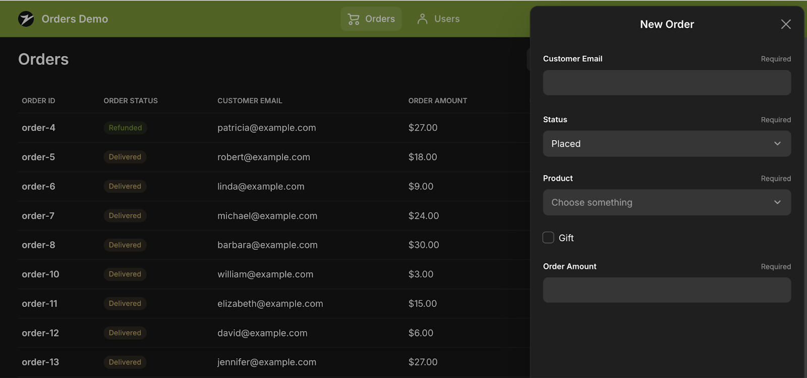
7: Configure the new order form - ‘Create’
While Glide sets up a basic form for you to add new records, customization is often necessary to ensure that data input is streamlined and effective. Begin by clicking the + Add button in the upper right corner just above your table to open the 'New Item' form. On the left sidebar, you will see the Components tree update to reflect the page or form you are working on.
Next, click on Options next to the General tab in the same configuration. You can change the default text from "Add item" to "New Order" to make it clearer what action users are taking. This text appears at the top of the form, so it's good to keep it informative.
In the form’s Components tree on the left, keep in mind that Glide doesn’t let you switch out a component type once you’ve chosen it, so you’ll need to reconfigure all the details if you change your mind. If you see any components in the form that don’t fit your needs, you’ll need to delete them and add new ones with the right type. For this form, delete these fields by clicking on X on the right side of the component:
- Increment_id (this will be set up to assign automatically)
- Status (change this to a dropdown)
- Product (change this to a dropdown)
- Created_at (we'll assign this automatically)
- Updated_at (we'll assign this automatically)
To edit existing components within your form, click on them in the Components tree. The settings pane on the right will update accordingly. Now let’s make sure that our forms are always filled out with the essential information:
- Select the email component and update the label to "Email." Under OPTIONS, check the box for ‘Required’.
- For the gift component, rename it to "Gift" and select Checkbox under ‘Style’.
- For the order_amount component, update the label to "Order Amount" and make it ‘Required’.
Finally, add two new Choice components for Status and Product: this will allow users to select from predefined options, making data entry more efficient and consistent. In the Components tree, click the plus sign, search for "Choice," and add the Choice component to your form.
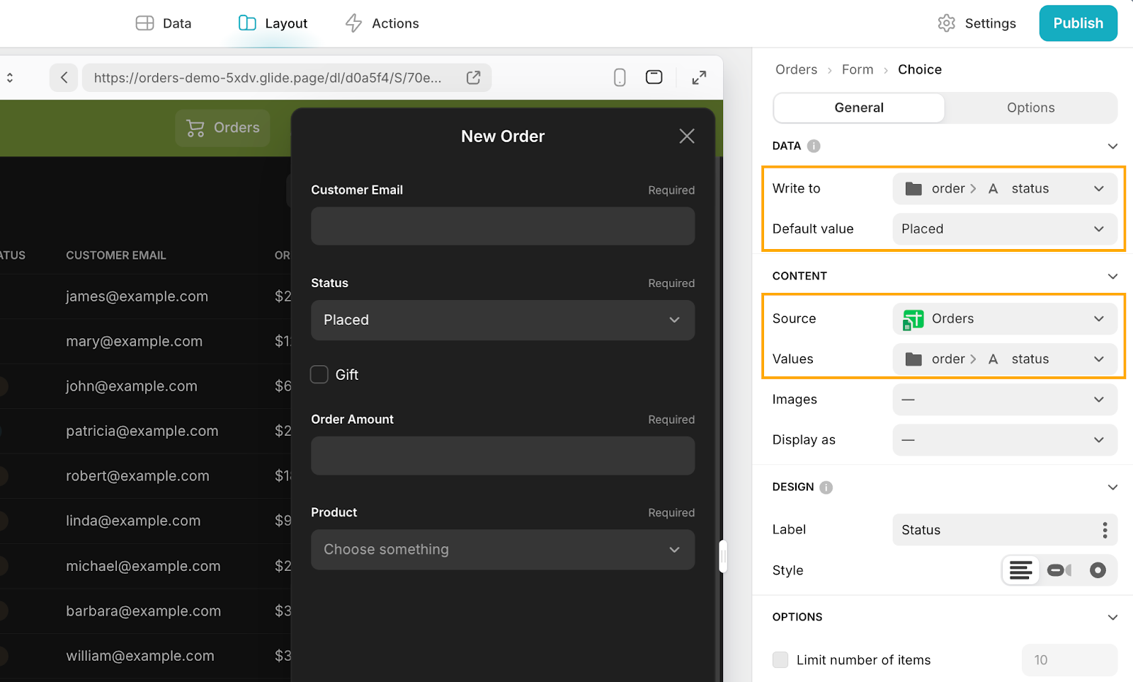
Now let’s make sure this data gets sent back to the correct place in our table. For the Status ‘Choice’ component, in the component configuration on the right side of the screen select the status column under ‘Write to’. This setting determines which column the data will be written to upon form submission.
Under Values, also select the status column. This configuration ensures that Glide uses the unique values from the status column to populate the dropdown menu options. Set the Default value to something like "Placed" to pre-select this option in the dropdown, then update the label and mark the component as required. Repeat this process for the Product component, but this time, you don’t need to set a default value.
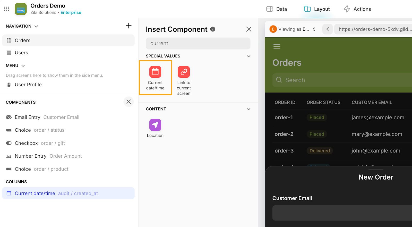
Next, to automatically assign the created date, add a new component by searching for "current" in the component menu on the left. Select ‘Current datetime’ from the list, and in the configuration screen on the right, choose the ‘created_at’ column. This will ensure that the form automatically fills the ‘created_at’ field with the current date and time when you submit a new order.
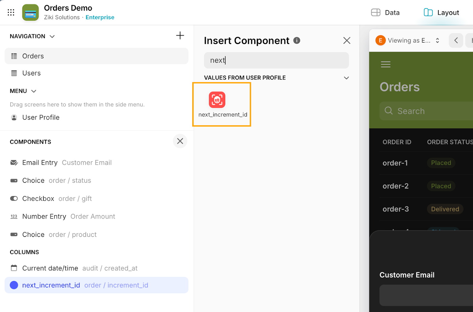
Add one last component by searching for "increment id" in the component menu. Under ‘Values from User Profile’, select ‘next_increment_id’ that we set up in the users table. In the configuration pane, set the column to ‘increment_id’. This will automatically generate the next increment ID for new entries.
Finally, arrange the input fields on the form by dragging and dropping them in the order you want. This order will show up on your form. Once you’re done, close the form to get back to the main Orders table screen.
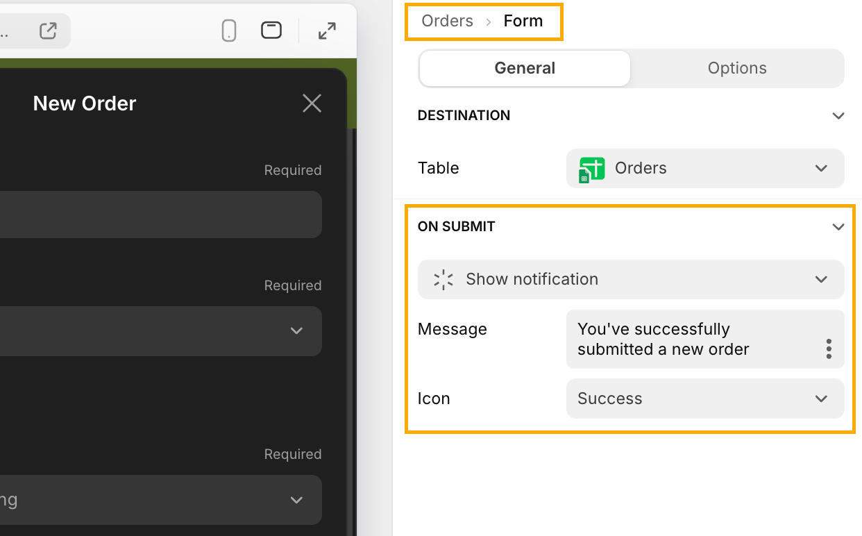
To set up the notification that appears upon form submission, go to the toolbar on the right side of the screen and navigate to Form > General. In the ‘On Submit action’ section, Glide defaults to 'Show notification'. Customize the confirmation message by entering your message in the 'Message' field (e.g., “You have successfully created a new order”). The configuration is saved automatically.
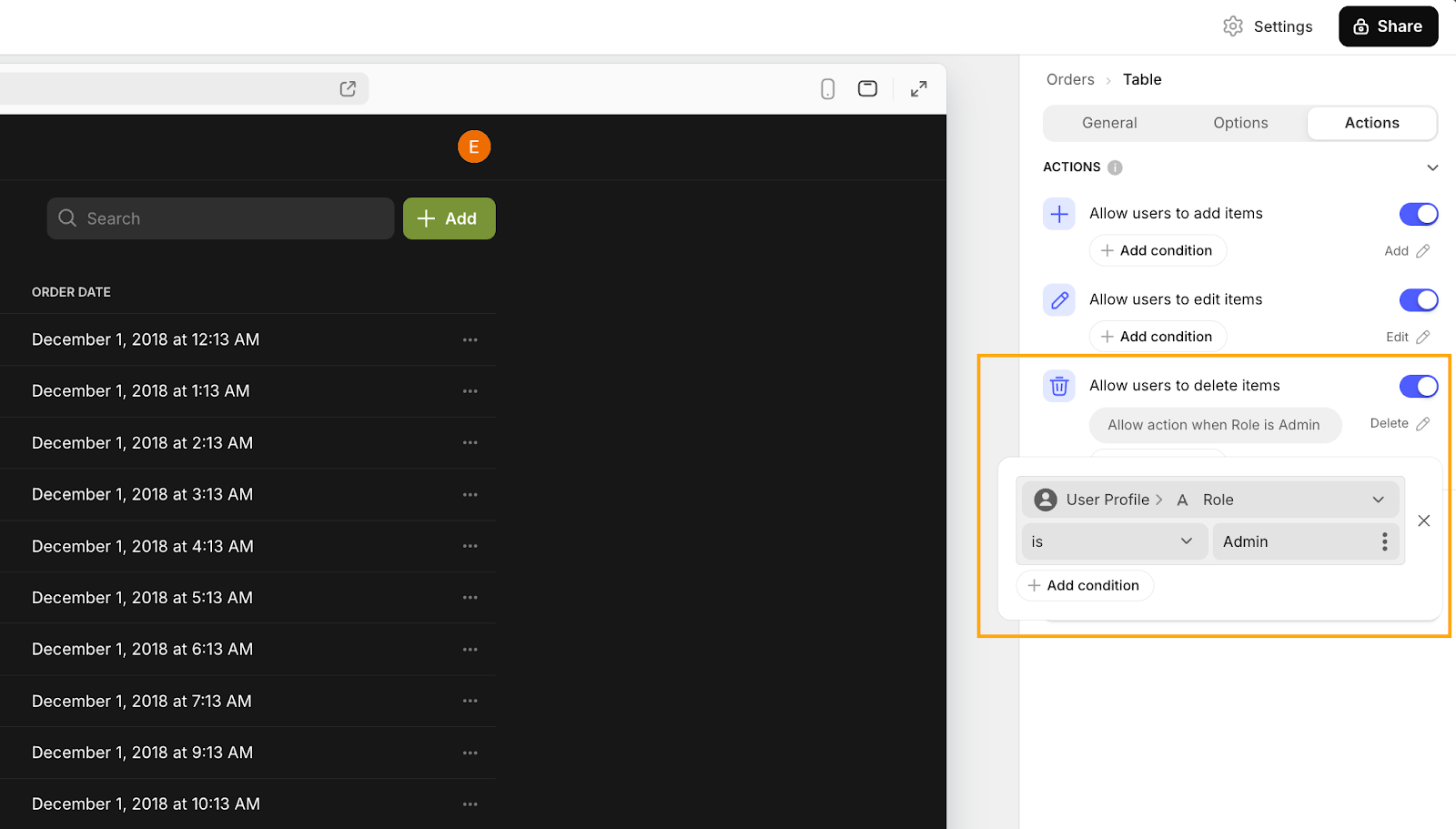
8: Add a Delete action
Okay, now we can read our data and create new entries. What we need now is a way to delete them too. Back on the main Orders table, start by clicking on the Table component in the Components tree. In the Table configuration menu, go to Actions and toggle on the Allow users to delete items option. This will add a ‘delete’ button to each row in your table.
Now, we all know that having a ‘delete’ button is a bit of a risky move, so this is why we set up our user roles table. To prevent accidental deletions and ensure only authorized users can delete items, we’ll restrict this action to Admins only. Under the ‘Allow users to delete items’ setting, click on + Add condition to set up a rule. Click on the gray condition to open the setup dialog, and configure it to: ‘User Profile -> Role is Admin’. This way, only users with the Admin role will see the delete option.
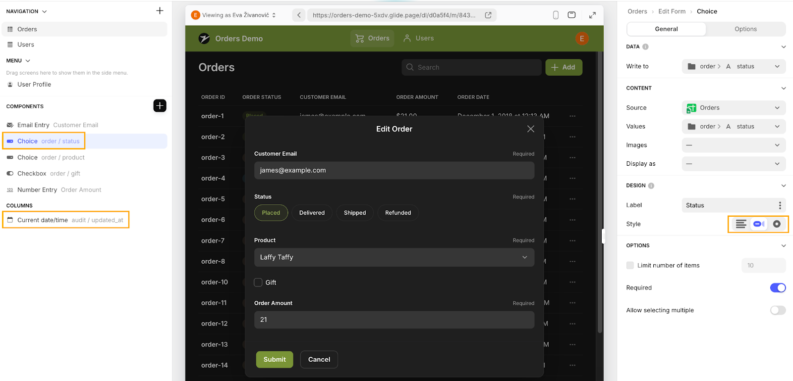
9: Setup the Edit Form - Update
Our final letter to tackle is U: Update. Luckily, setting up the Edit form is similar to configuring the New Order form, so it's a good opportunity to apply what you've learned from Step 6. A lot of this set-up is preconfigured. So, to start, access the edit screen by clicking on the three dots next to any order and selecting ‘Edit’. This will open up the ‘Edit item’ form.
Here are three key changes we made to this design, and why we made them:
- Status Field Style: For the Status field, we changed the style from a dropdown to Chips. This makes it easier to update the order status with a quick, visual selection. We recommend using consistent component types for create and update forms to ensure the best user experience, but this is another option for dropdown selection that might offer better UX.
- Update Date: Instead of using Current datetime for the creation date, set it to write to the updated_at column. This will update the modification date rather than the creation date.
- Order ID: Since the Order ID is already generated and doesn’t need editing, you can skip adding this component to the form.
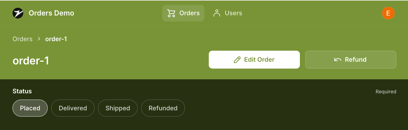
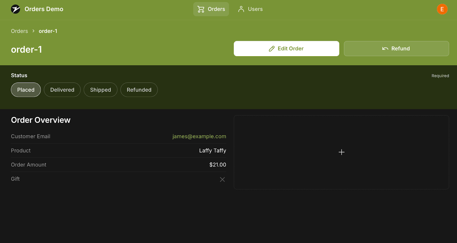
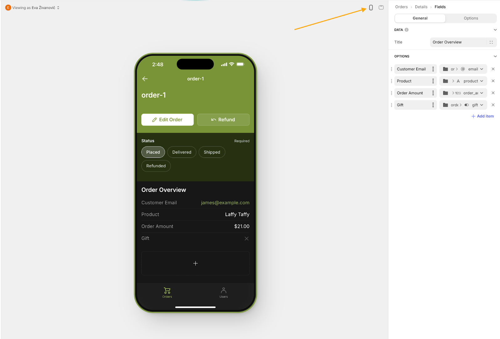
10: Setup the Order detail screen
Finally, let’s boost our Read functionality by setting up an order detail screen that expands on the table data. This ensures that our table data stays nice and tidy, including only the information that needs to be compared, while further details are only seen when manually expanded.
To set up the Order Detail screen, start by clicking on an Order ID from the Orders table. You’ll likely find that the default details view isn’t very visually engaging, so let’s make some improvements.
First, let’s modify the link breadcrumbs. Currently, they display the order status, but we want them to show the Order ID for better clarity.
Here’s how to do it:
- Click on the Breadcrumbs component in the components tree.
- In the configuration pane on the right, select the Details tab.
- Under the Title section, choose ‘order_id’. This change will ensure that the breadcrumbs display the Order ID, making it easier for users to identify the order they are viewing.
These adjustments will help make the Order Detail screen more user-friendly by aiding navigation.
Next, let’s make some tweaks to the Order Detail screen to give it a cleaner look.
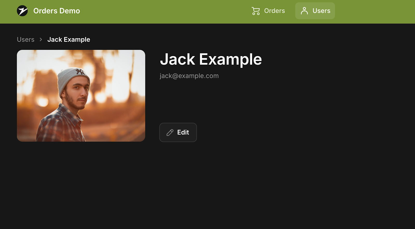
First, remove the Title component. The Title is handy for pages with images such as a user profile page (as you can see on the example below), but since we don’t have an image for our orders, it’s better to use a Text component instead. Simply hover over the Title component and click the X to delete it.
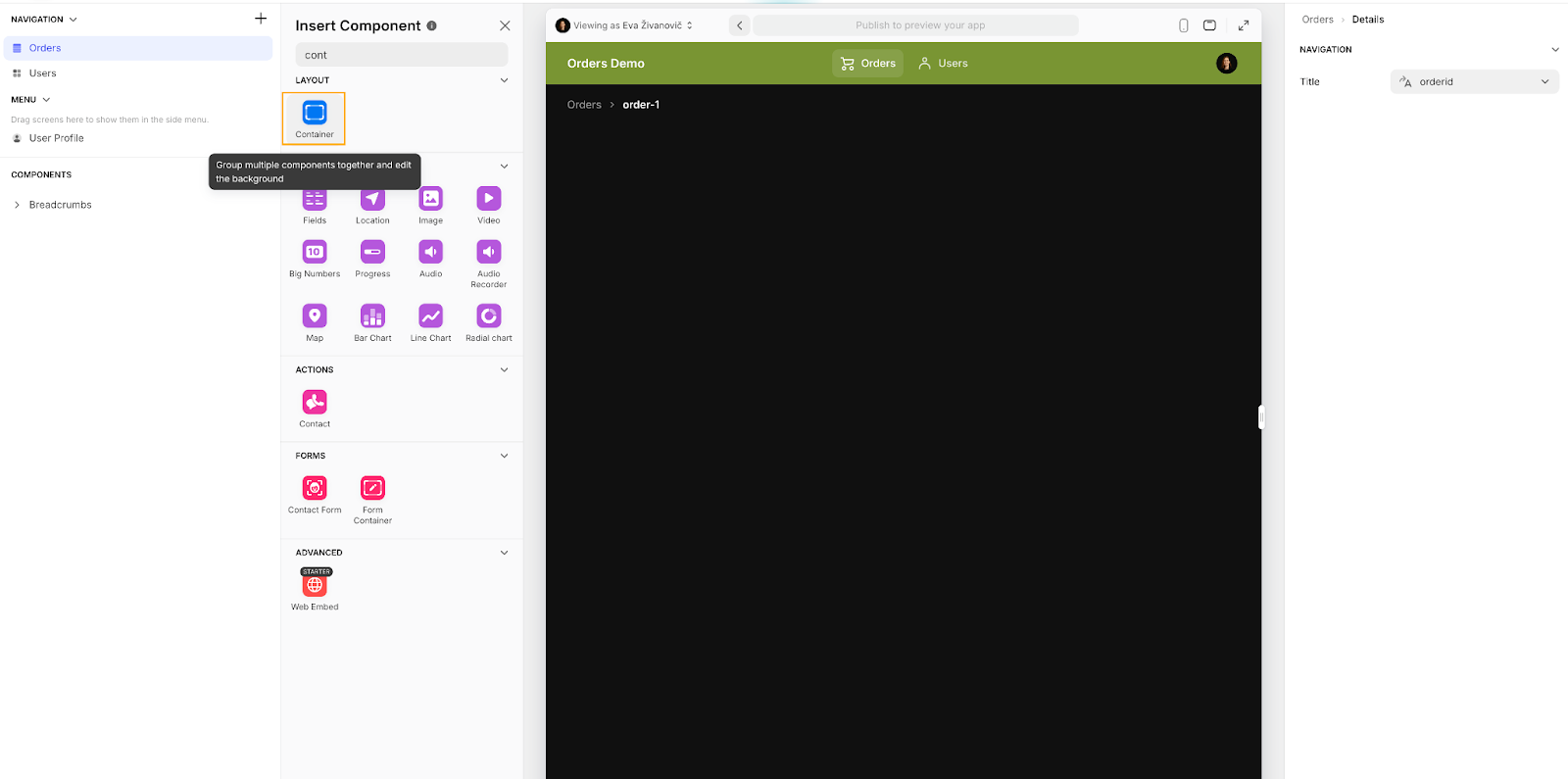
Before we add the text component, to improve the layout of your page and components, we’ll use Containers. Containers help group and style components, making your screen more organized and visually appealing. They allow you to create columns and group related components, giving the Order Detail screen a polished look.
Here’s how to add a container:
- In the Components tree, click on the plus sign.
- Type “Container” in the search bar and select it from the list.
- Click on the Container component to add it to your screen.
In the Layout section, choose the ‘1:1’ option to split the Container into two columns and allow you to organize your content better. Then, scroll to the Design section and set the Background to ‘Accent’ for a bolder look that highlights the content better. You can also adjust the Padding, Width, and Alignment to further refine how the container and its content are presented.
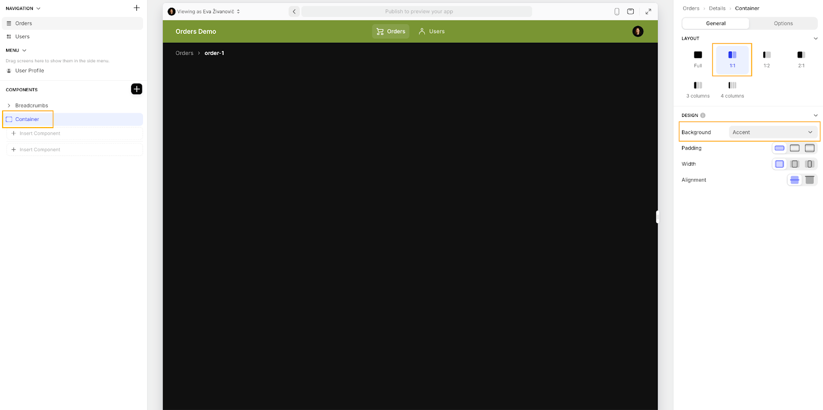
The new 1:1 layout splits the container into two sections: one on top and one on the bottom. You’ll see these sections in the Components tree, and they’ll appear as two columns on your screen.
To get things organized:
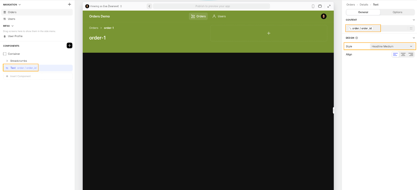
- Drag and drop breadcrumbs into the container: Move the Breadcrumbs component into the upper section of the container in the Components tree. This keeps the navigation info neatly at the top.
- Add a text component: Just below the Breadcrumbs in the upper section, add a Text component. This is where you’ll display additional details.
Configure the Text component with the following settings:
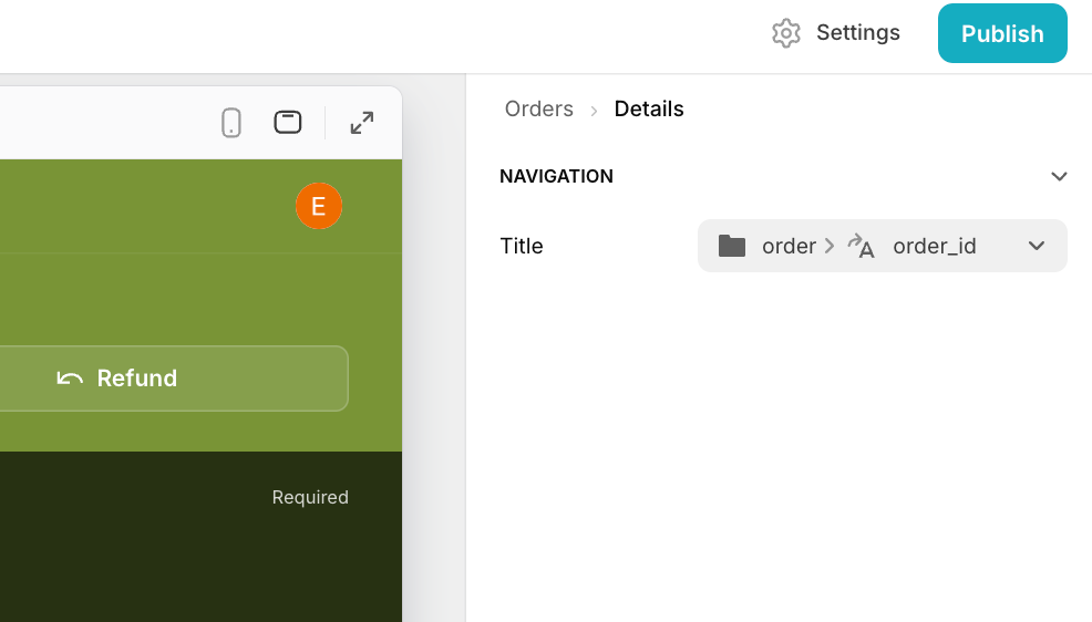
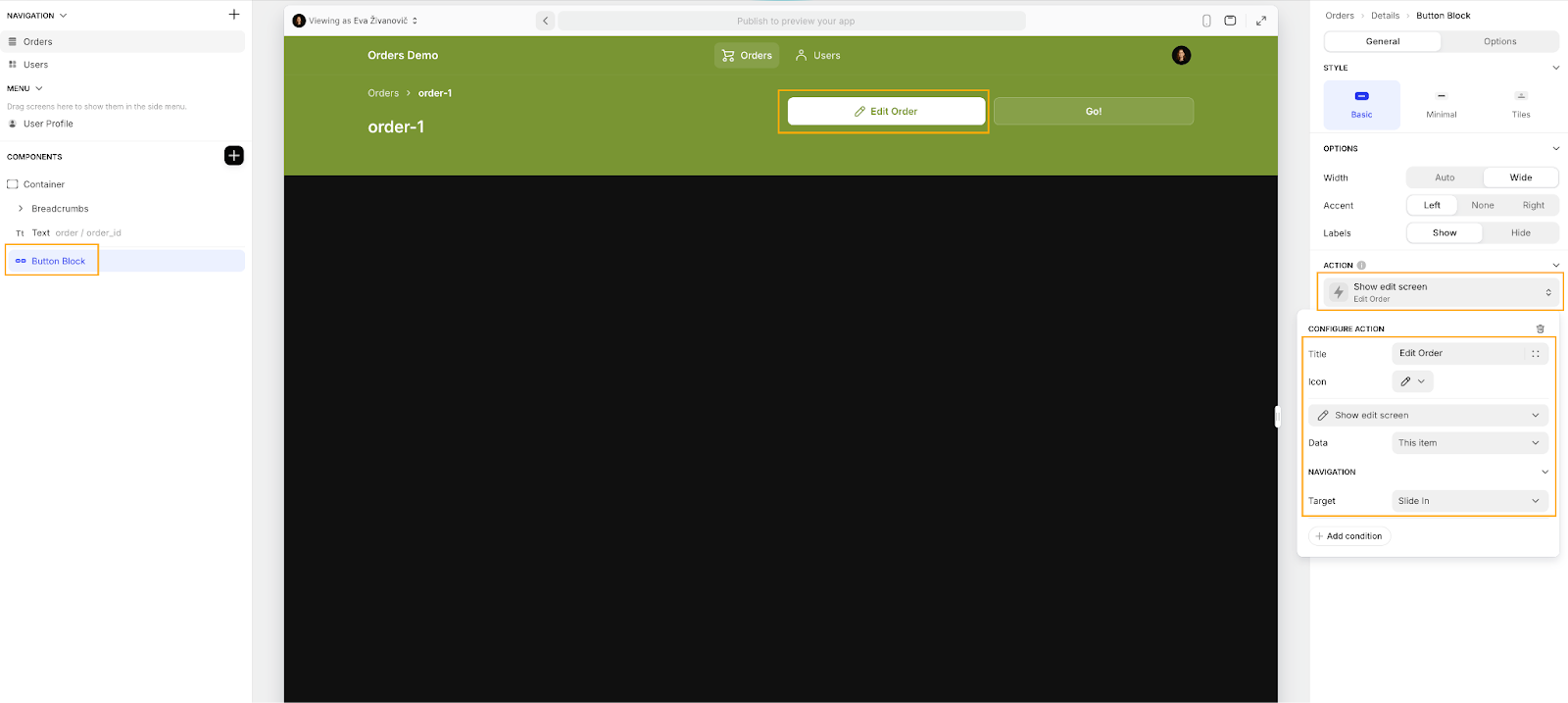
Now, let's add a ‘Button Block’ component to the lower section of the container so that we can also edit the details from this page too. Choose the Button Block component from the Component picker, and drag and drop it into the lower section of the container. Change the button label to "Edit Order," select an appropriate icon (like a pencil), and set the action to ‘Show edit screen’. For the target, choose ‘Slide In’ to make sure the edit screen slides in from the side when you click the button. This setup will give users an easy way to edit the order right from the detail view.
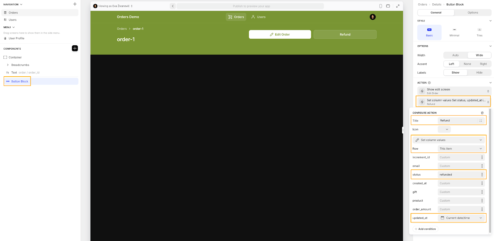
Next, open the second action and rename it to "Refund". Update the icon to match the action (like a “back arrow”), and choose ‘Set column values’ as the action type. In the settings, set the status column to ‘Refunded’ and use the Current date/time variable for the ‘updated_at’ column. This way, the status will be marked as ‘Refunded’ and the timestamp will show when the refund happened.
To tidy up the layout a little more:
- Add a Separator component into the lower section of the container, just above the Button Block. Set the Separator to ‘Medium size’ and make sure to uncheck the Draw Line toggle to keep things clean.
- Add another container to the layout. Inside this new container, drag in a Choice component. This Choice component will help users display and update the order status easily. Configure it by setting ‘Write to’ and ‘Values’ to the ‘order_status’ column, and choose ‘Chips’ under Style. Update the label and mark it as ‘required’ to make sure it’s clear and functional.
- Finally, click on the container and set the Background to ‘Dark’, or pick a background that fits your design. This will make the status section stand out and improve the overall readability.
- Add a final container from the Components tree and place the ‘Fields’ component inside it. The Fields component will show non-editable values of your data record. In the configuration pane, remove any unnecessary fields like ‘increment_id’, ‘order_id’, and ‘status’ by clicking the X next to each one.
If you need to add more fields, click on + Add item below the existing fields in the configuration pane. Update the labels and select the appropriate values from the dropdown menus. Set the Title to "Order Overview" to display a static title above the fields in the UI, giving users clear context of the data.
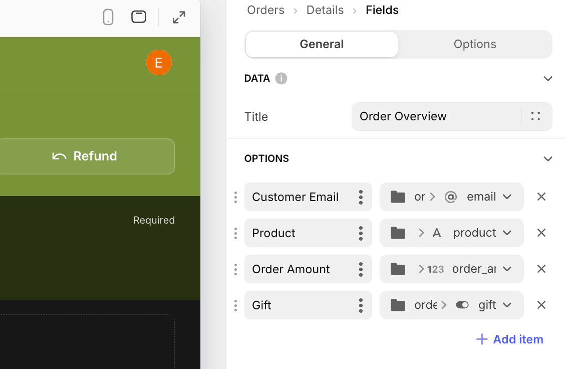
For a more polished look, click on the container that holds the Fields component and go to the Layout settings. Choose the ‘1:1’ option to split the container into two columns. This will help you organize the fields more neatly and make the data easier to read.
What we particularly love about Glide, is the mobile app support. All you need to do to see how your layout looks on mobile, is click the mobile phone icon left of the configuration pane. This switches your view to a mobile preview, allowing you to check how your design adapts to smaller screens.
Mobile apps can be particularly useful for field workers, such as those in the warehouse, and having a mobile version of an app is often a great option. The mobile support in Glide is one of our favorite out of its competitors - don’t forget you can read more in our full guide.
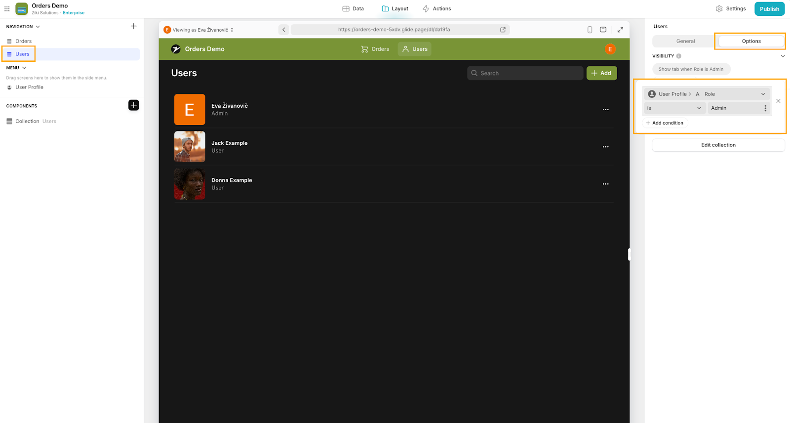
11: Hide Users Tab and Assign User Roles
Before finalizing and publishing your app, let's make some key adjustments for better user management in the app. Start by hiding the Users tab (which Glide automatically generated for you when the app was created) so that it's only accessible to Admins. To do this, select the ‘Users’ tab from the NAVIGATION section above the Components tree. Then, click on ‘Options’ in the tab configuration on the right. Under Visibility, click + Add condition and set it to: ‘User Profile' > ‘Role is Admin’. This ensures only Admins can access this tab.
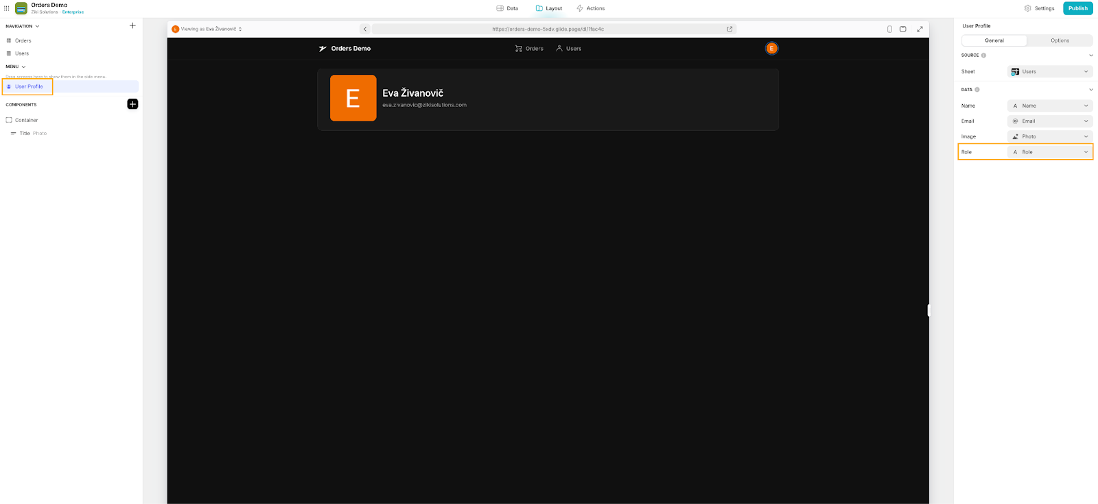
Finally, make sure the User table shows the correct user role. Go to the NAVIGATION section in the left sidebar and select User Profile. In the right sidebar, under Role, you then need to select the 'Role' column to display the user role they’ve been allocated. You could also follow similar steps to our edit form to set up the ability for admins to update user roles from here too.
12: Customize and publish the app
Let’s finish off here with some infrastructural elements that will help get our app ready for deployment. There are a few minor things you'll want to update in Settings to ensure the right people have access and to make the app truly yours. Start by navigating to the ‘Settings’ section, where you can update the title of your application, upload your logo (if you have one), change the app icon, and add a description. For detailed info on these settings, check out Glide’s documentation.
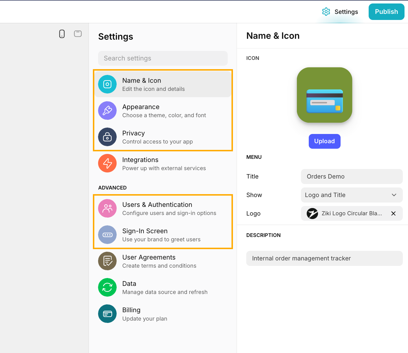
Under Appearance, you can adjust the design and color of your app. This includes tweaking the sidebar appearance, choosing between dark or light mode, and adjusting content width among other options to suit your preferences.
In the Privacy section, you can configure who should have access to your app. With a free Glide account, you're limited to 10 personal users (i.e. using personal email addresses that aren’t on a business domain), but with the free premium trial, you can invite both personal and business users. For specifics on user limits and options, check Glide’s pricing details. We write more about the different pricing tiers here.
Lastly, if you’d like, you can also customize your app’s Sign-In Screen.
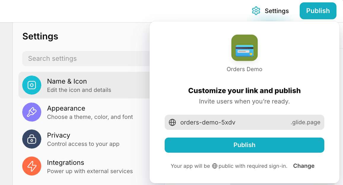
When you're happy with everything, it's time to deploy! Click Publish in the upper right corner, then you can customize your link (optional), and click the second Publish button. This will generate a QR code and a link you can share with your users.
And there you go! You've built a fully functional web and mobile-responsive app on top of your Google Sheets data.
This app now allows you to organize your data neatly, lets you create and update your data in a streamlined and secure way and ensures your data is always the right format. Plus, it gives you control over who can delete data, adding an extra layer of security.
As a bonus, you can now upgrade your app by adding a dashboard to track open orders, revenue over time, and more. This setup offers much better security and reliability compared to just using Google Sheets, where actions can be less traceable and lack proper data validation.
Happy building!

